How to Create a Pivot Table in Excel (A Comprehensive Guide for Beginners)
This video tutorial offers a comprehensive guide for beginners on how to create a pivot table in Excel.
The pivot table serves as a powerful tool through which we can analyse and summarise even large amounts of data in a quick and very convenient way. All that without the necessity to know complicated Excel functions. How great is that?
Let’s have a look at how to create a pivot table in Excel now!
How to Prepare Source Data for a Pivot Table
To create a pivot table in Excel, it might be a good idea to start with a thorough source data preparation.
So, we’ll organise the source data according to the following three steps:
Step one – check for empty rows or columns in the source data table. Empty rows and columns can cause various issues or even affect the correctness of results.
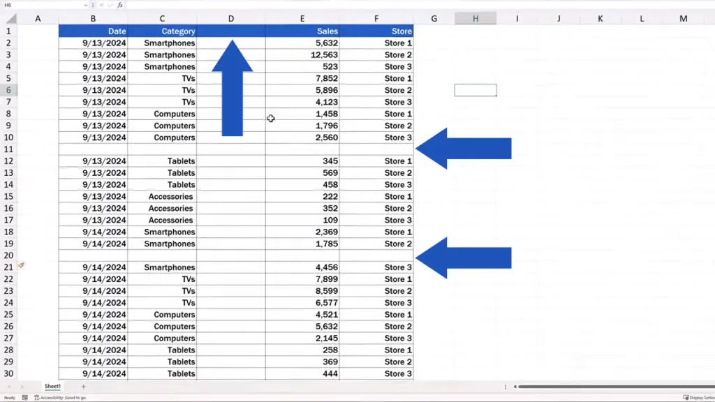
If there are any empty rows or columns in the data table but it’s not many, you can remove them in a simple way. Right-click on an empty row or column and click on ‘Delete’.
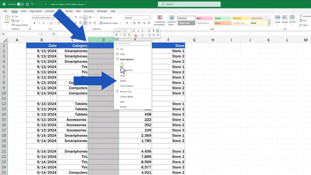
But if there are hundreds or even thousands of empty rows or columns in the data table, use the little trick you can learn in our EasyClick Academy video tutorial titled How to Remove Blank Rows in Excel. The link to the video is in the description below.
In the second step, we need to make sure that each column in the source data table has got its own header, which is basically the title thanks to which we’ll always know what sort of data the column contains. Our columns are marked ‘Date’, ‘Category’, ‘Sales’, and ‘Store’.
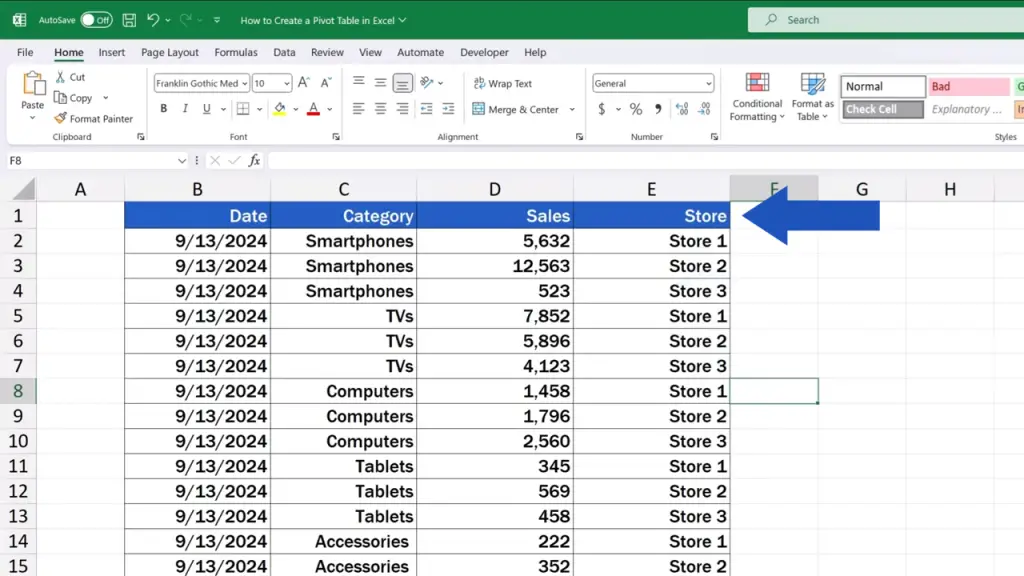
And here’s the final step of the preparation – step three.
We format the source data as a table. This ensures better data processing and it helps us avoid mistakes if we want to make additions to the source data later.
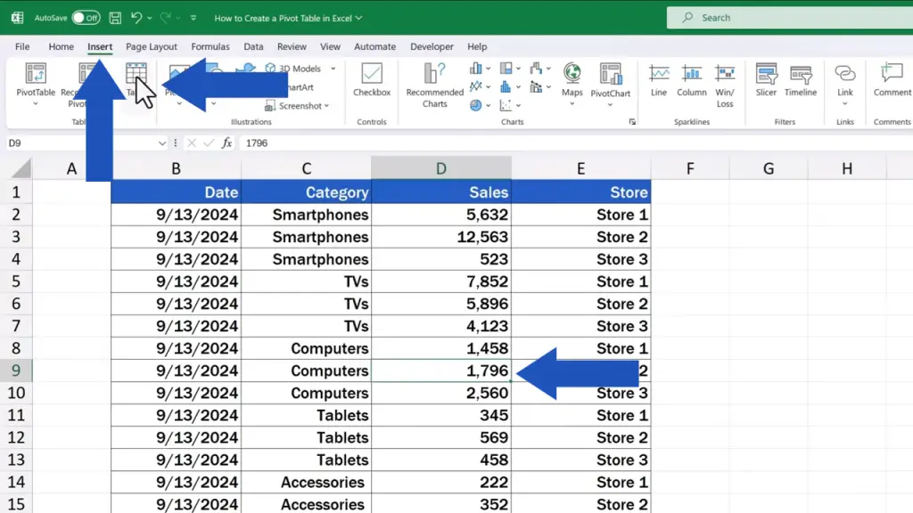
So, let’s format the data as a table now.
First, click anywhere into the source data area, then go to the ‘Insert’ tab and find and click on ‘Table’.
A window pops up, which we’ll move over here now. There are two bits of information that need to be defined.
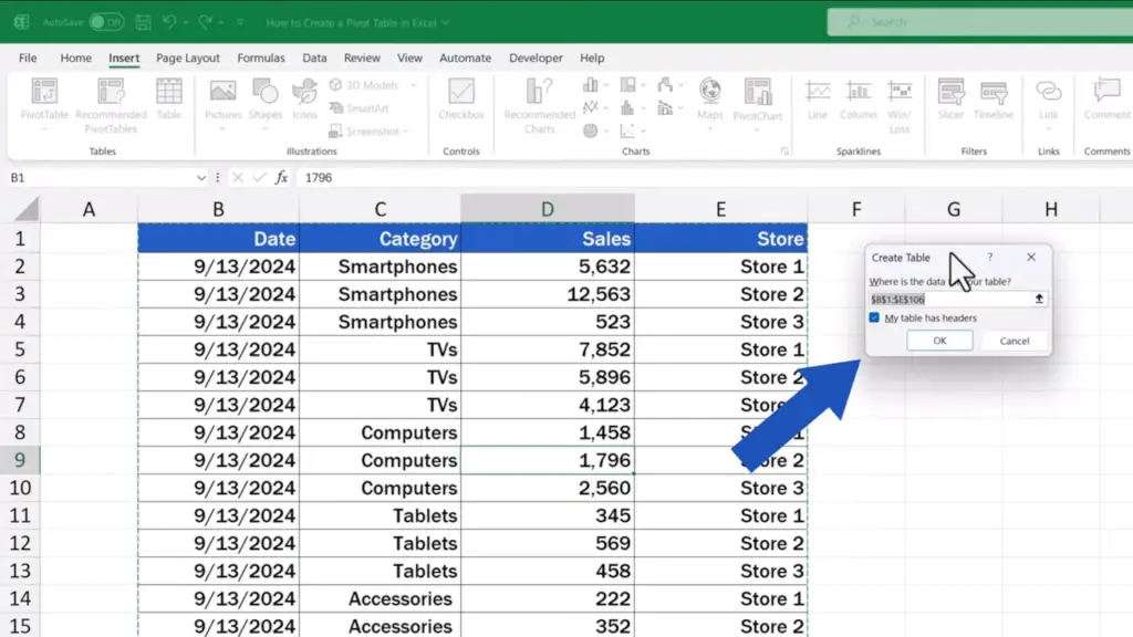
The first is the range of data to be included in the table. Because we’ve already clicked into the source data area, Excel provides us with a suggestion for the data range we most probably want to include in the table.
We double-check it, just in case, and yes, it’s correct, starting with the cell B1 up to the cell E106 including, which is indicated by this green dotted line. If you need to change the range for any reason, you can do so using this little button on the right.
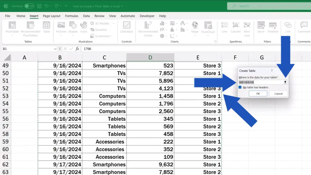
As soon as the range’s been set correctly, we need to tick this box here, which says that the table’s got headers.
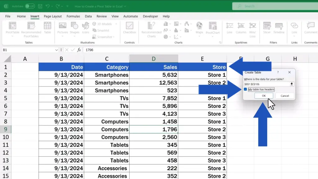
After clicking on ‘OK’, we’ve got the data formatted as a table, which we can also spot up here – a new tab called ‘Table Design’ has been added.
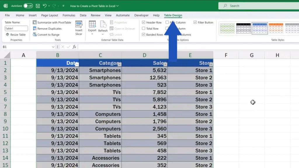
For more details on how to format a table and how to use various helpful features in the ‘Table Design’ tab, watch a separate video tutorial by EasyClick Academy titled How to Make a Table in Excel.
To access the ‘Table Design’ tab is pretty easy. If you click outside the data table, it disappears.
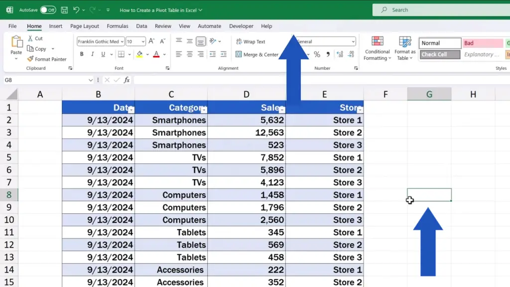
Once you click back into the table, you’ll see it up in the ribbon again.
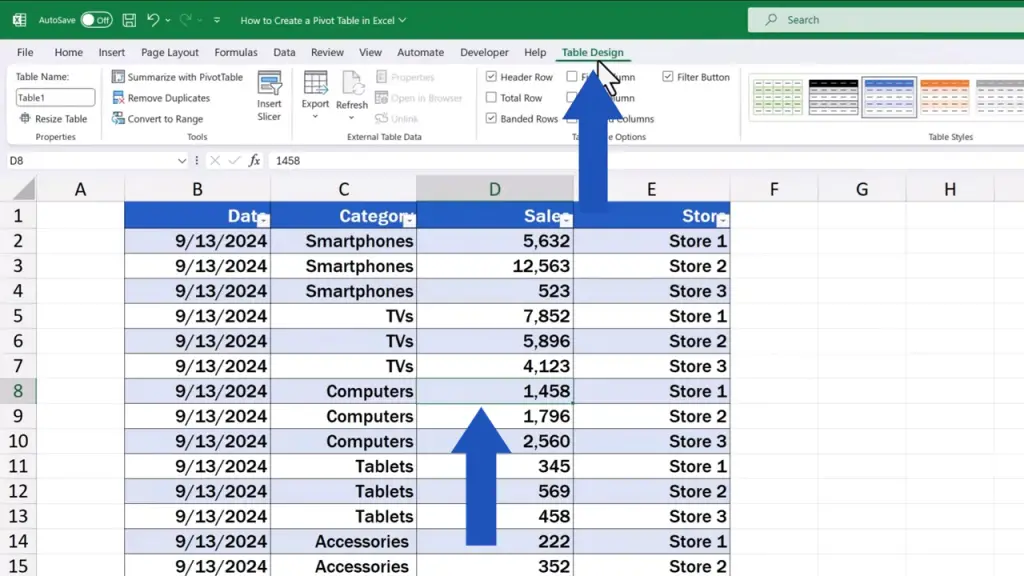
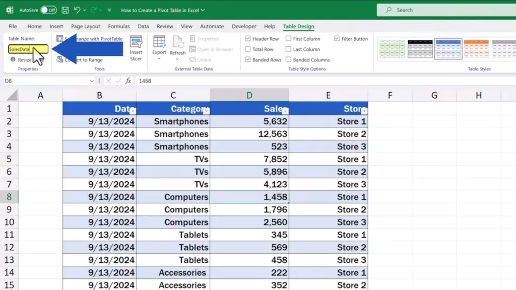
To come up with an appropriate table title is also very useful. We can type, for instance, ‘SalesData’ here in the field ‘Table Name’. Assigning a title to a table means you’ll gain a better overview of the data you’re working with.
How to Create a Pivot Table Using Recommended Options
As soon as we’ve finished the source data preparation according to the three steps we’ve just discussed, it’s time to start working on the pivot table itself.
So, let’s get into it now!
We click anywhere into the source data area. Then we click on the ‘Insert’ tab and here we can decide between
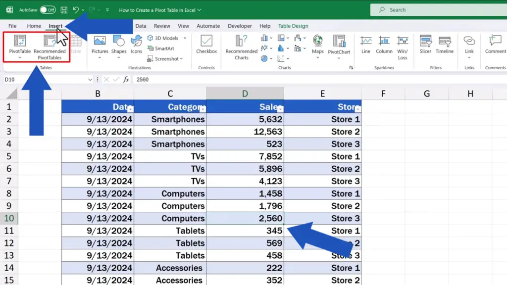
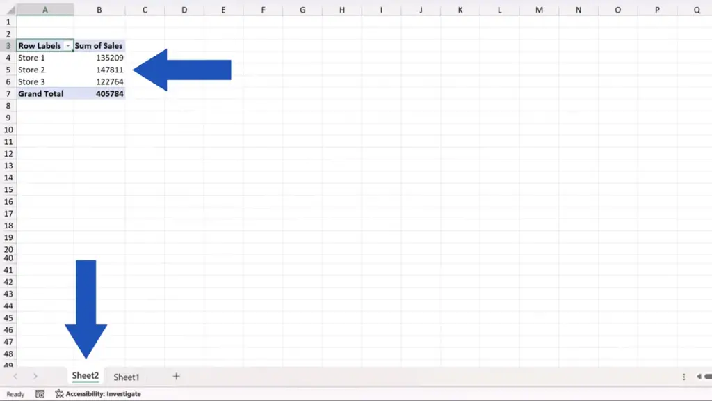
The first, and also the quick one is to click on the option ‘Recommended PivotTables’. Excel then shows several pivot tables as suggestions that might be useful for you. For example, here we’ve got sums of sales by category. This is the first recommended pivot table. The second one shows sums of sales by store.
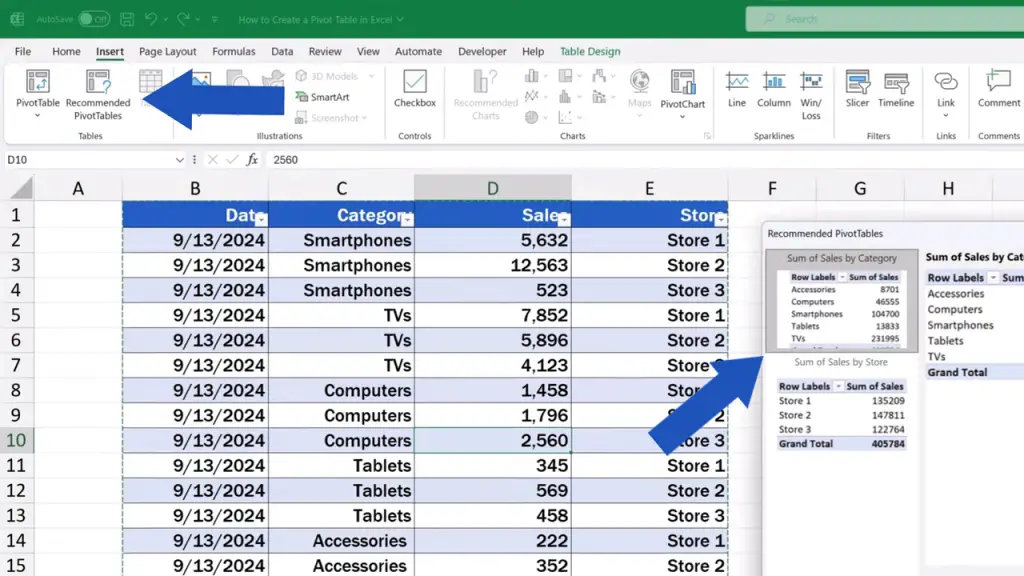
If these suggestions work for you, select one and click on ‘OK’ down here.
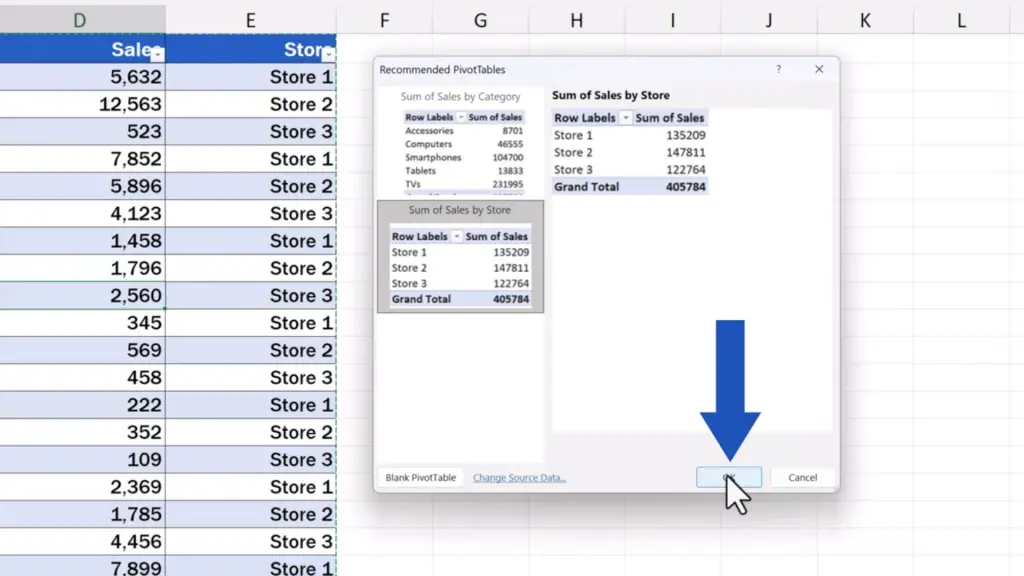
The pivot table simply appears in a separate sheet and you can modify it according to what you need. We’ll take a look at how to do this shortly.
How to Create a Custom Pivot Table
But now let’s go back to Sheet1, where we store the source data and let’s explore the other, more advanced option to create a pivot table in Excel. So, we’re not going the predefined way now, but we’ll create a pivot table ourselves and we’ll do it basically from scratch.
Again, we click into the source data area, go to the ‘Insert’ tab, but here we select the other option – ‘PivotTable’.
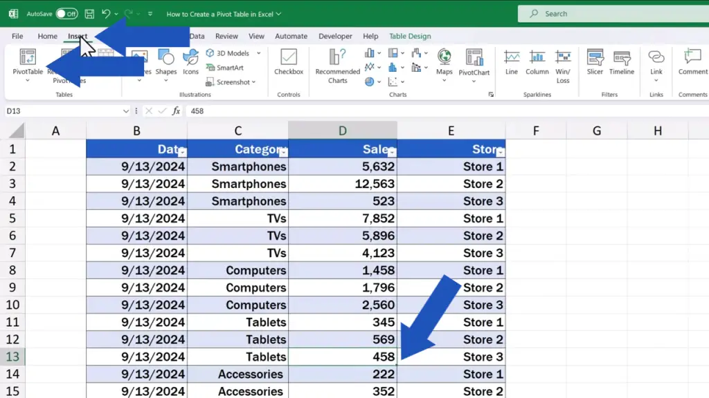
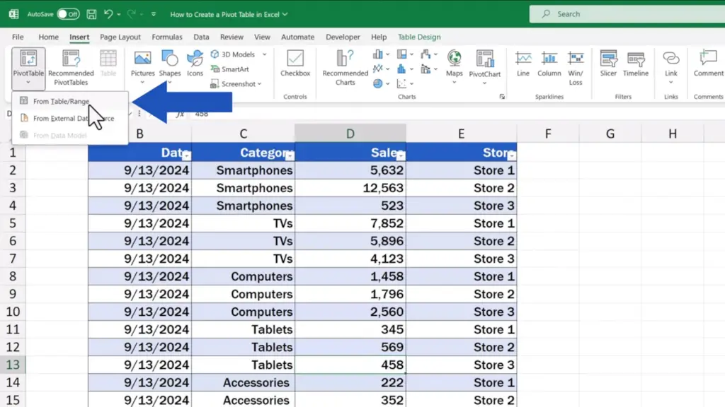
As you can see, we can create a pivot table in Excel using the data we’ve got stored directly in an Excel spreadsheet, but we can also use data from various external sources.
Using external sources is, however, a more advanced topic which we may elaborate on in one of our further video tutorials. Now, we’re going to focus on how to create a pivot table from the source data we store directly in an Excel sheet.
So, we select the option ‘From Table/Range’ now and we can move on.
Here we’ve got a new pop-up window where we need to define the following two details.
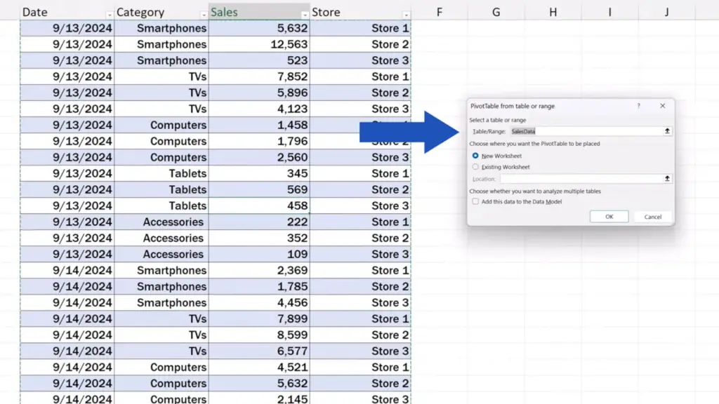
First, we need to specify which data should be used to create the pivot table. Since we formatted the data as a table earlier, Excel shows it as the first option. Here we can see the title ‘SalesData’ which we entered as a table name earlier.
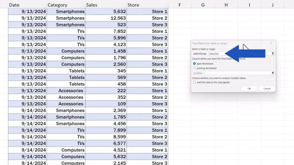
Of course, this button on the right serves to specify any data range to create a pivot table if needed.
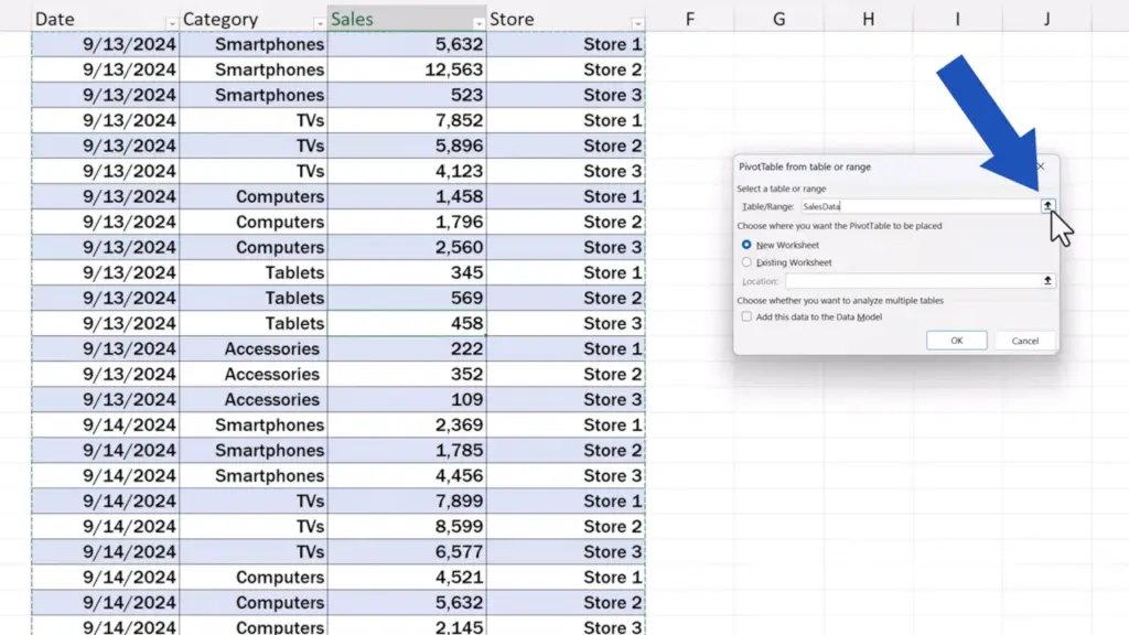
However, to simply type up a specific range reference directly into the field can cause issues if we decide to add some rows or columns into the source data table later on. The range would have to be updated manually after any addition.
But if we’ve formatted the data as a table, Excel will always include everything from the data table area in the pivot table. So, if we add some new rows or columns, they’ll be incorporated in the source data table and included in the pivot table, too. We can explore how new data can be added in a separate video tutorial. Now, it’s important to keep in mind that the data should be formatted as a table in the source data preparation phase.
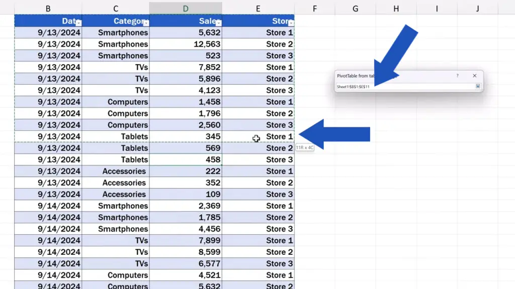
In this case, we make sure that the table title ‘SalesData’ appears in the field and we can move on then.
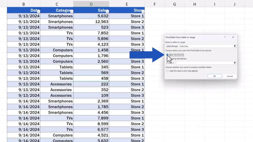
Below we can choose whether we want the pivot table to be placed in a new or an existing worksheet. For convenience, we select a new worksheet here.
Moving on, we don’t necessarily have to tick the option ‘Add this data to the Data Model’. Ticking this box leads to more advanced analyses, which we can discuss in separate video tutorials. If you’d like to know more about this topic and learn new, more advanced tips and tricks for working with a pivot table, leave us a note in the comments section below and we’ll be happy to prepare more video tutorials for you.
But now we’re not going to discuss more advanced options, so we’ll leave the box blank and move on.
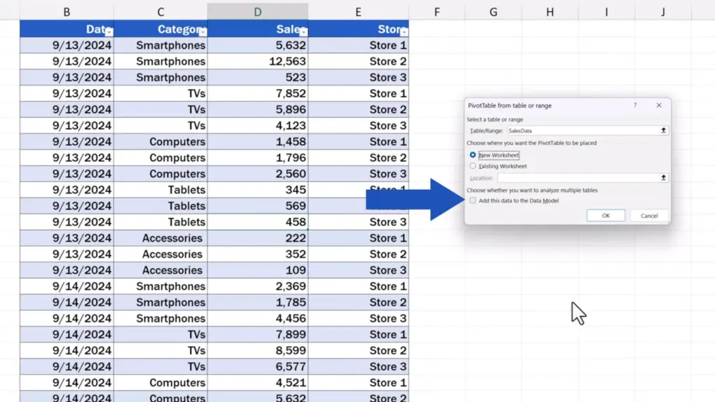
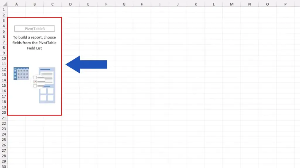
Once everything’s been set and defined, we click on ‘OK’ and here comes a new sheet with everything ready for us to create a pivot table just according to our needs.
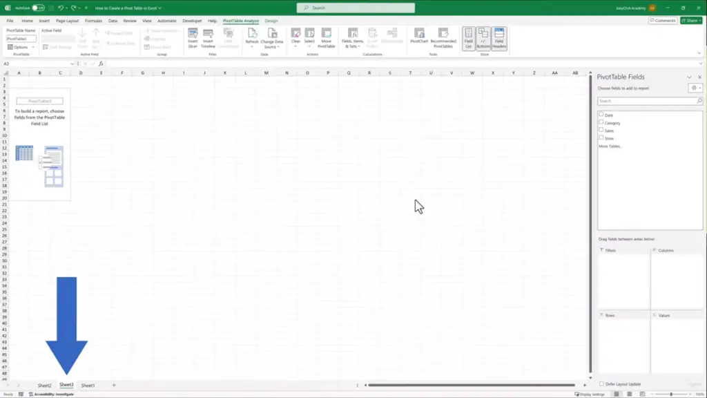
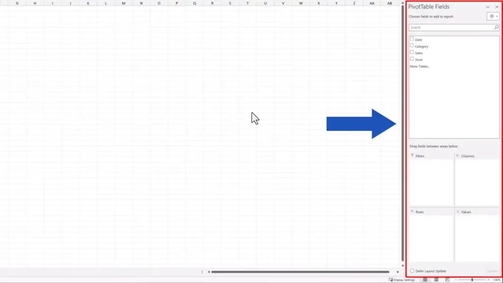
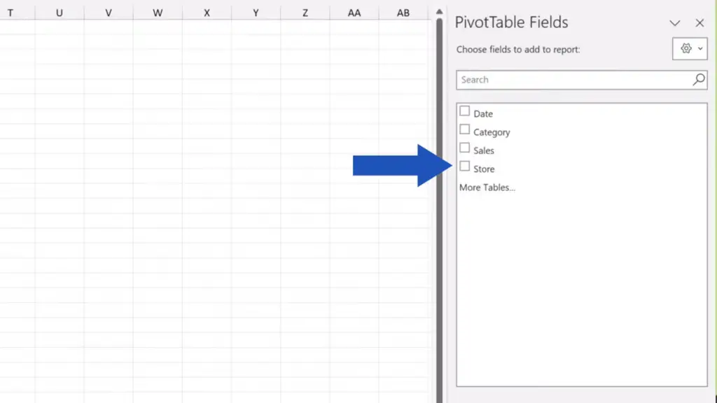
On the right there are ‘PivotTable Fields’ where we can find so-called fields, which actually is a list of our column headers in the source data table. So, we can see here all the titles we’ve entered during the source data preparation phase. We’re going to work with these further when creating the pivot table, but before we get to that, let’s go through all the sections we can see here, on the pane.
Below are four areas: Filters, Columns, Rows, and Values. These are crucial if we want to process the data as a pivot table in a number of ways. We’re going to explore how and when to use each area in a moment.
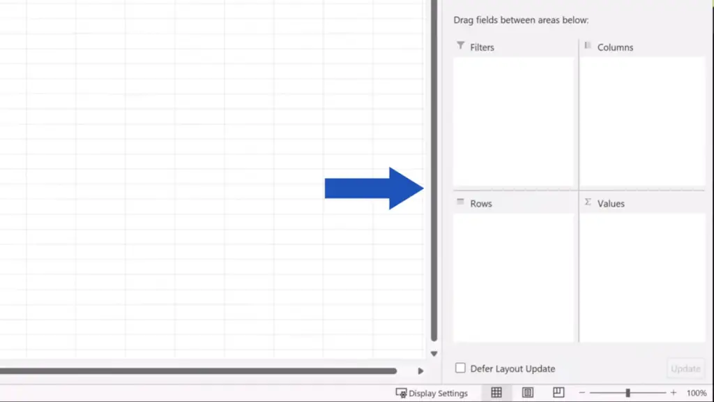
So, the pane ‘PivotTable Fields’ on the right serves for building a pivot table and here, on the left, we’ll be able to see the actual pivot table.
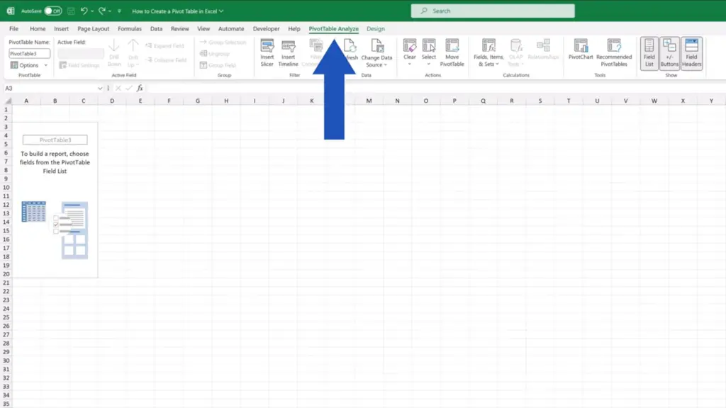
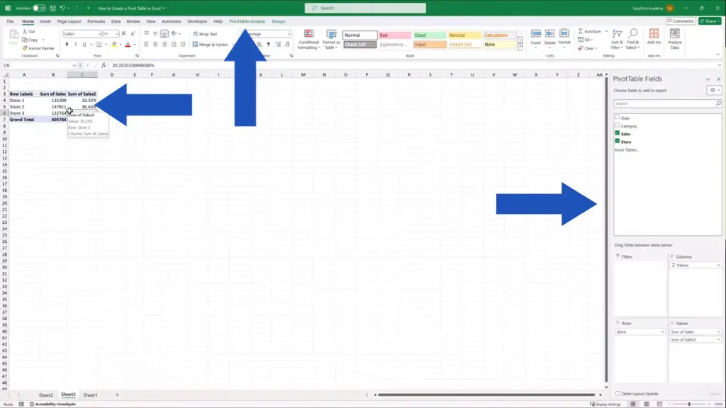
There’s also a new tab, ‘PivotTable Analyze’, that’s appeared up here, in the ribbon. We can use the tab when creating pivot tables.
So, it’s time to have a look at how to use all this to create a pivot table according to what we need.
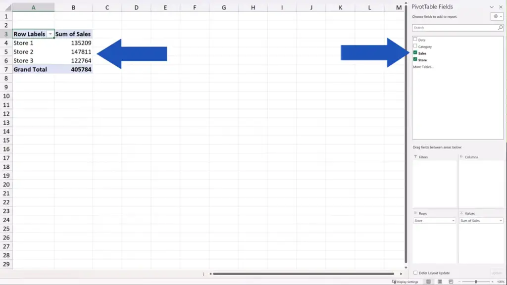
Let’s say we want to create a report which would show sums of sales by store. So, we tick the box next to ‘Store’ and we can immediately see the three stores from our source data table included in the pivot table.
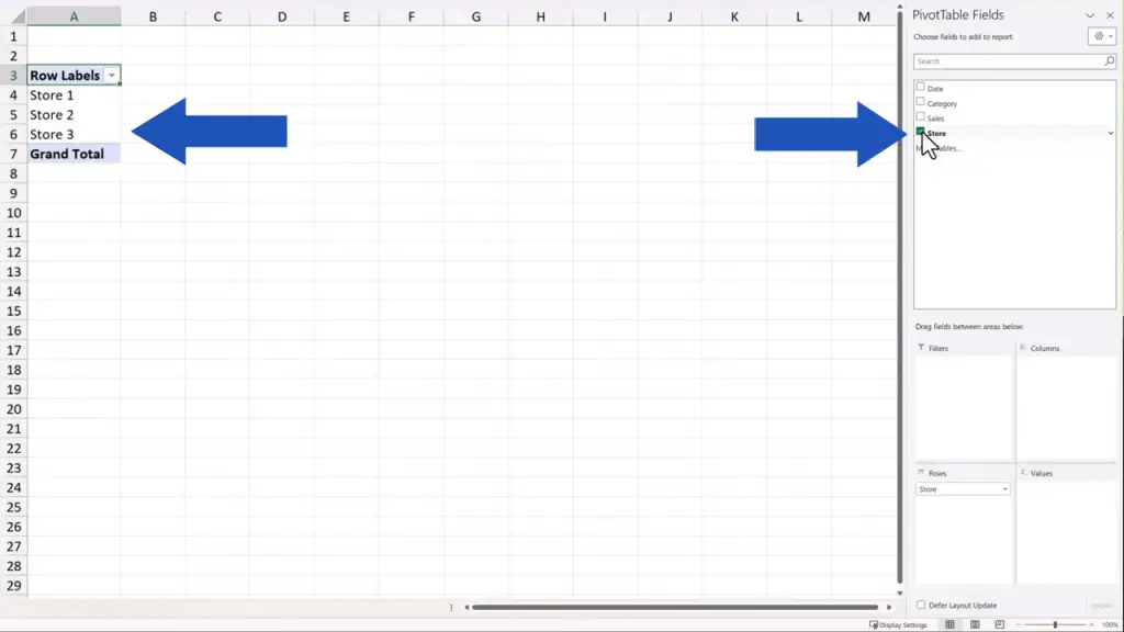
Now, when we tick ‘Sales’, we see the total sales for each store.
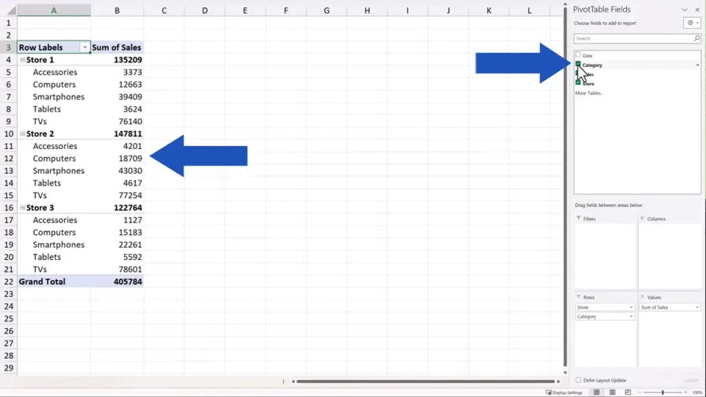
If we want to display the information about sales in each product category for each store, we tick ‘Category’ in the part of the pane with fields and here we go – for each store there’s an overview of sales by category.
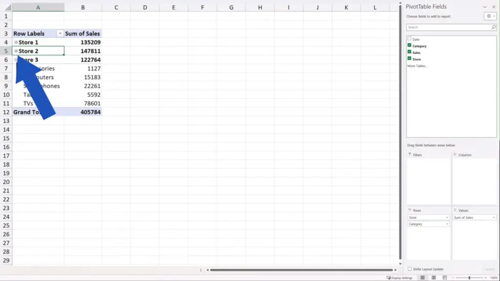
These data can be made visible or we can hide them simply through the button that’s just appeared in the pivot table next to each store name.
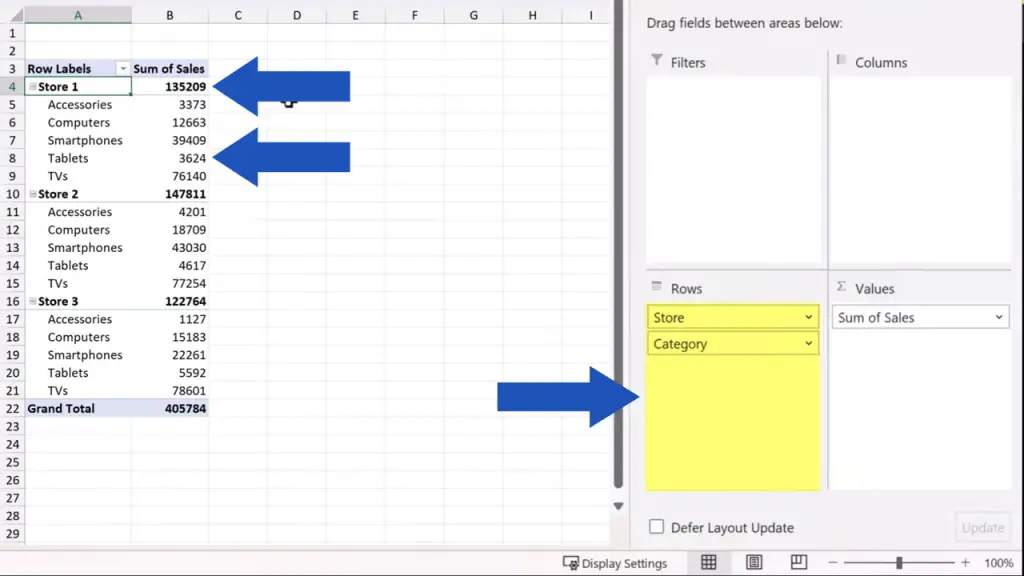
And here’s an important detail to remember. You can see here on the right that the fields ‘Store’ and ‘Category’ have been assigned to the area ‘Rows’. That makes them appear in rows in the pivot table.
If needed, we can move, for example, ‘Category’ to the area ‘Columns’ through a simple drag-and-drop. And here’s the modified pivot table – product categories like ‘Accessories’, ‘Computers’, ‘Smartphones’, and others now show in columns.
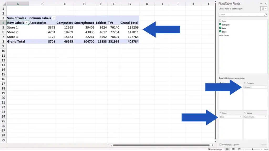
Thanks to this simple drag-and-drop move, we can create the pivot table according to our needs, showing just the data we need to show, in the way we want them to show. Basically, whatever we need to display in rows, we drag and drop to ‘Rows’.
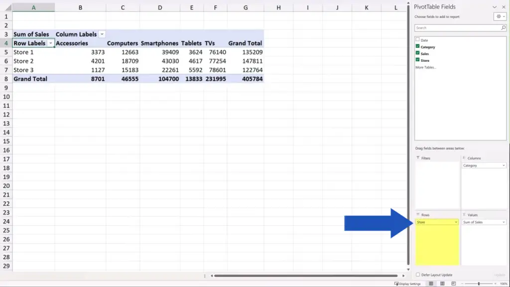
And whatever we want to show in columns, we drag and drop to ‘Columns’.
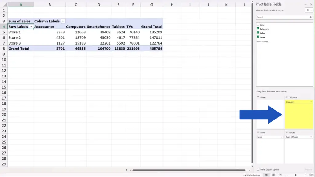
And of course, we can change this anytime. So, ‘Category’ can be moved back to ‘Rows’ again.
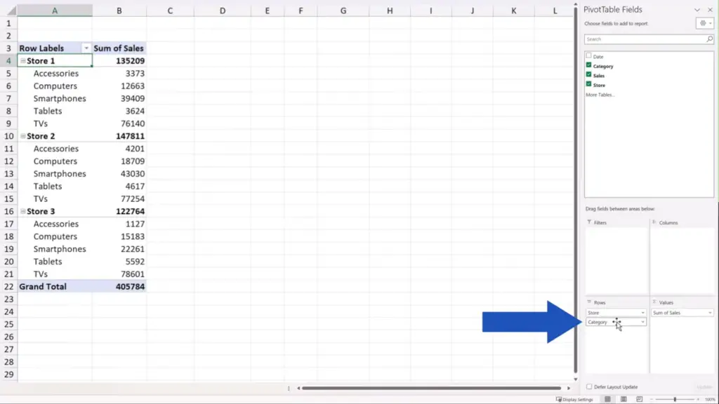
Or if we don’t need to include these values in the pivot table, we can simply drag and drop the field anywhere on the screen and it’ll be removed from the pivot table.
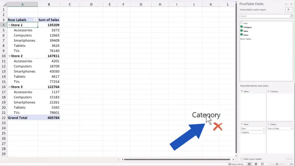
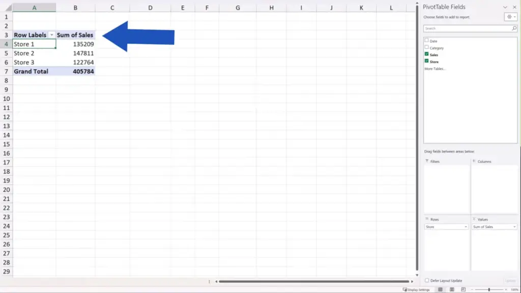
Now we can move on and have a look at the area called ‘Values’. There are some interesting tricks that we can try out here, so let’s have a look.
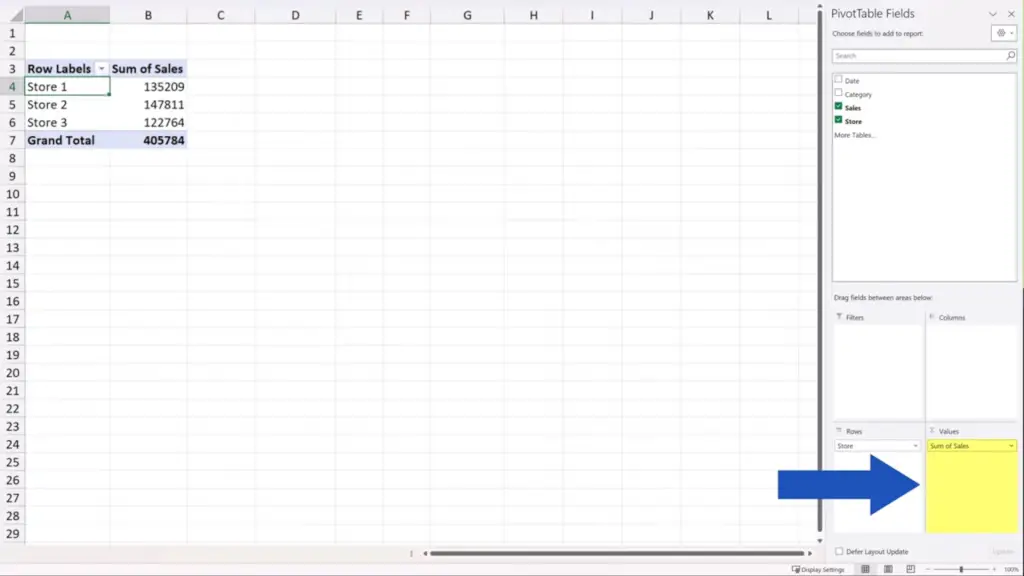
Let’s take the field ‘Sales’ and drag and drop it to the ‘Values’ area again.
If you notice column C, it contains the copy of the ‘Sum of Sales’ data set and the same item is also included in the ‘Values’ area down here, on the right. So, now we’re working with two columns containing the ‘Sum of Sales’ data set in the pivot table.
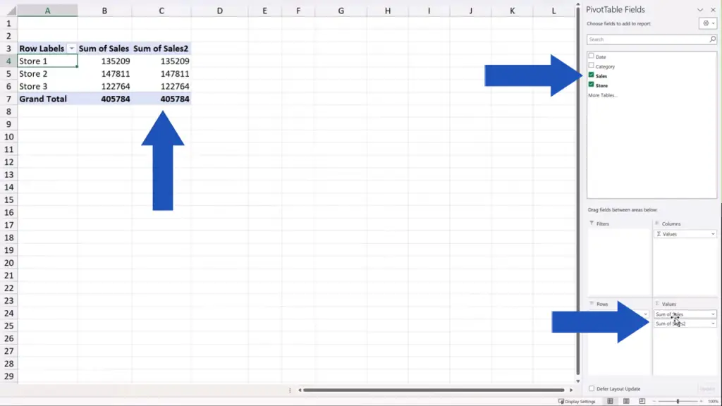
If we click anywhere in column C and then do a right-click, we can use the option ‘Summarize Values By’ or right below, there’s the option ‘Show Values As’. Both options allow us to display the values of the data set in various ways.
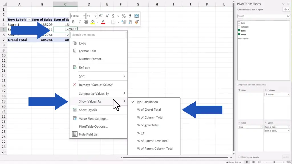
Here we’ll go ahead and display the values as ‘% of Grand Total’.
Now, the pivot table shows not only the exact number representing the sum of sales for each store, but it also displays these values as the exact percentage that the sum of sales makes of the grand total.
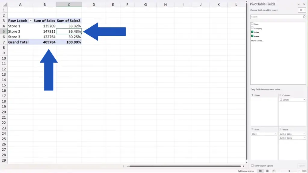
This is how we can easily use numerous options to summarise values or display them in various ways.
How to Filter Data in a Pivot Table
Let’s move on now and take a look at the fourth area – ‘Filters’, which offers interesting ways to filter the source data.
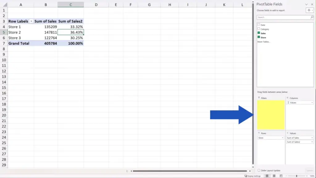
For example, we can take the column ‘Category’ from the list and drag and drop it to ‘Filters’.
Excel now offers the possibility to filter the data based on ‘Category’ right above the pivot table.
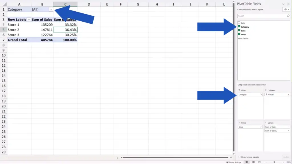
Now, when we click on the filter button and tick the option ‘Select Multiple Items’, we can quickly and conveniently filter the sales for any product category.
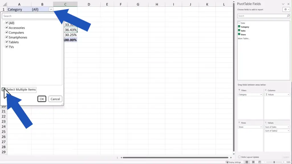
Let’s select ‘TVs’ now, press OK, and here we are looking at the TVs sales numbers for each of the three stores.
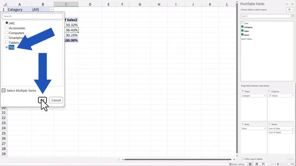
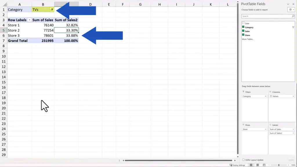
This way we can individually filter any category, but we can also do this with multiple categories at the same time. Let’s do multiple categories with ‘Smartphones’ and ‘Tablets’, for instance.
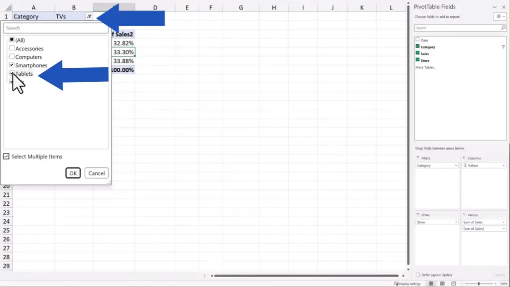
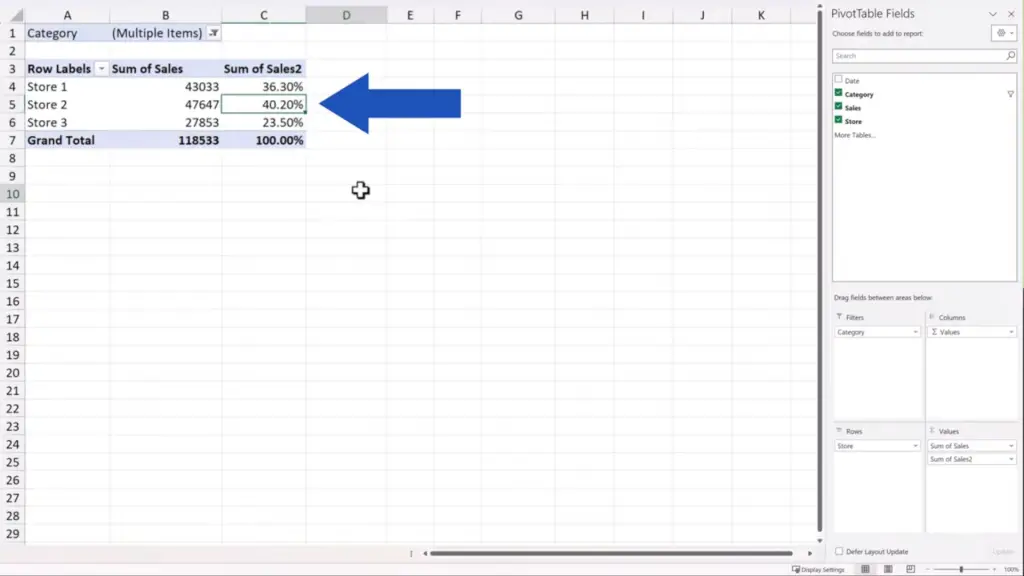
And here they are! This is a very effective way to filter data and to get the information we need as quickly as possible.
If we don’t need the filter anymore, we can remove it from the pivot table with no effort at all. We just click anywhere within the pivot table area to see the pane on the right, and we use drag-and-drop to remove the column ‘Category’ from ‘Filters’.
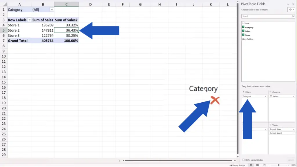
And here we go again – the filter’s gone!
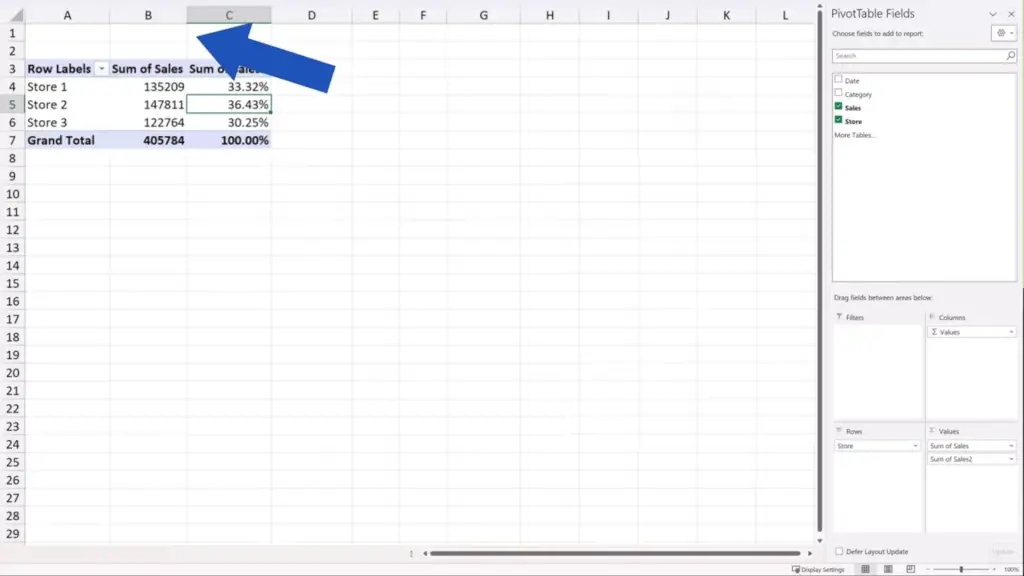
But that’s not all!
Let’s have a look at several other tips thanks to which you’ll be able to make more effective pivot tables.
First, let’s talk a little bit about some basics around the pivot table. If you click anywhere outside the pivot table area, the pane on the right as well as the ‘PivotTable’ tab disappear. If you click back into the pivot table area, the pane on the right and the ‘PivotTable’ tab show again, ready to be used.
How to Format Pivot Table Data
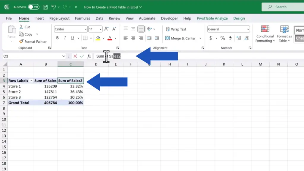
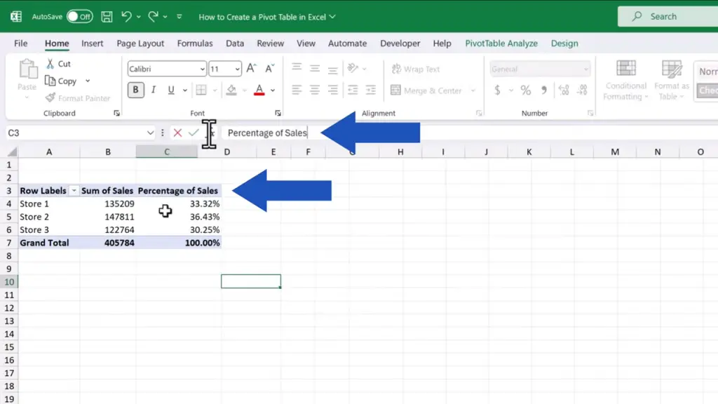
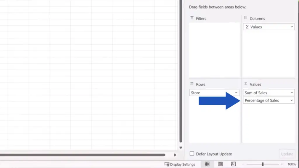
To rewrite a header in the pivot table, simply click into the cell which stores the header name and rewrite the text as needed. Here we’re rewriting the cell C3 to ‘Percentage of Sales’…and the header has immediately changed in the pivot table as well as in the pane on the right. So, we can navigate through the data more easily now.
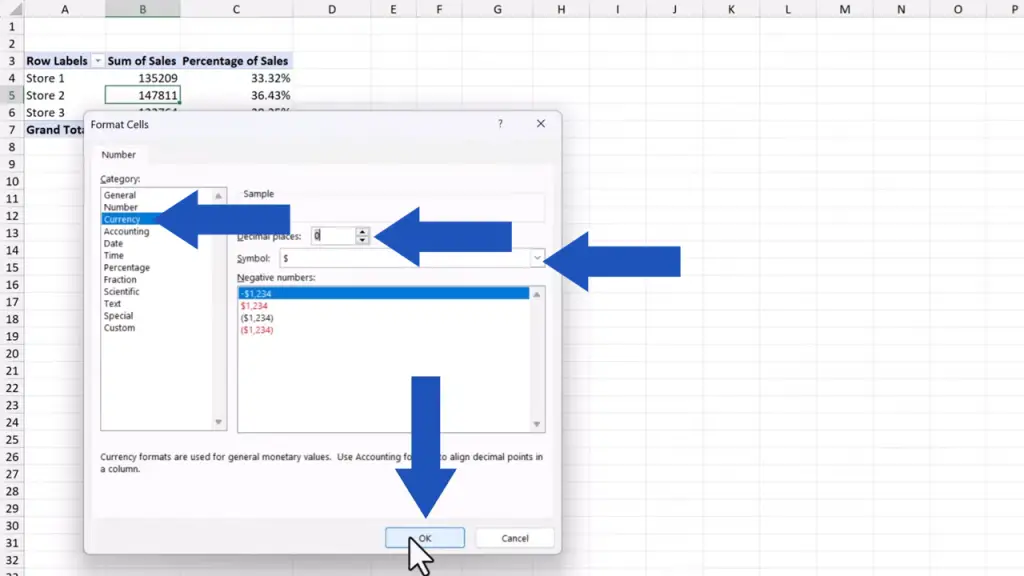
To change number formatting in the pivot table is no rocket science either. Let’s say we want to format the column ‘Sales’. So, we select the column, then we right-click and select the option ‘Number Format’.
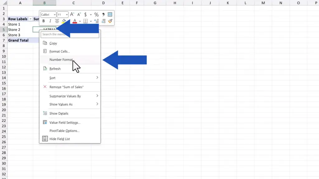
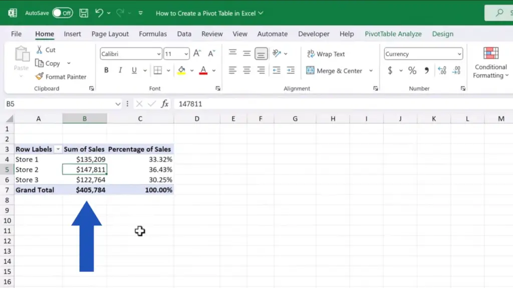
Here we can set the currency, and we can choose the number of decimal places we want to display – in this case none. We keep the dollar symbol, press OK and that’s it.
The numbers in the pivot table now show just as we formatted them a moment ago.
How to Change Pivot Table Design
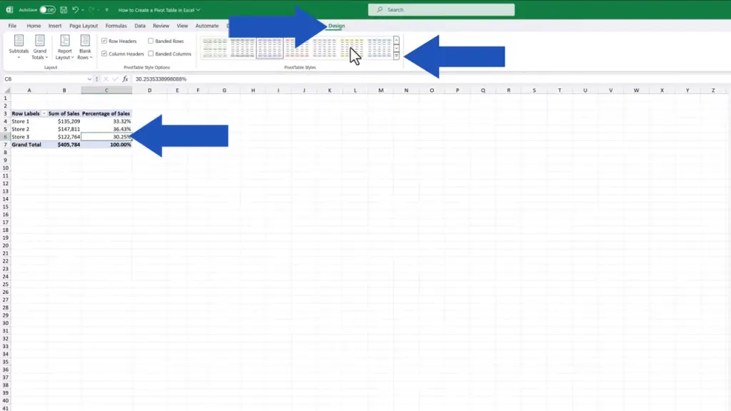
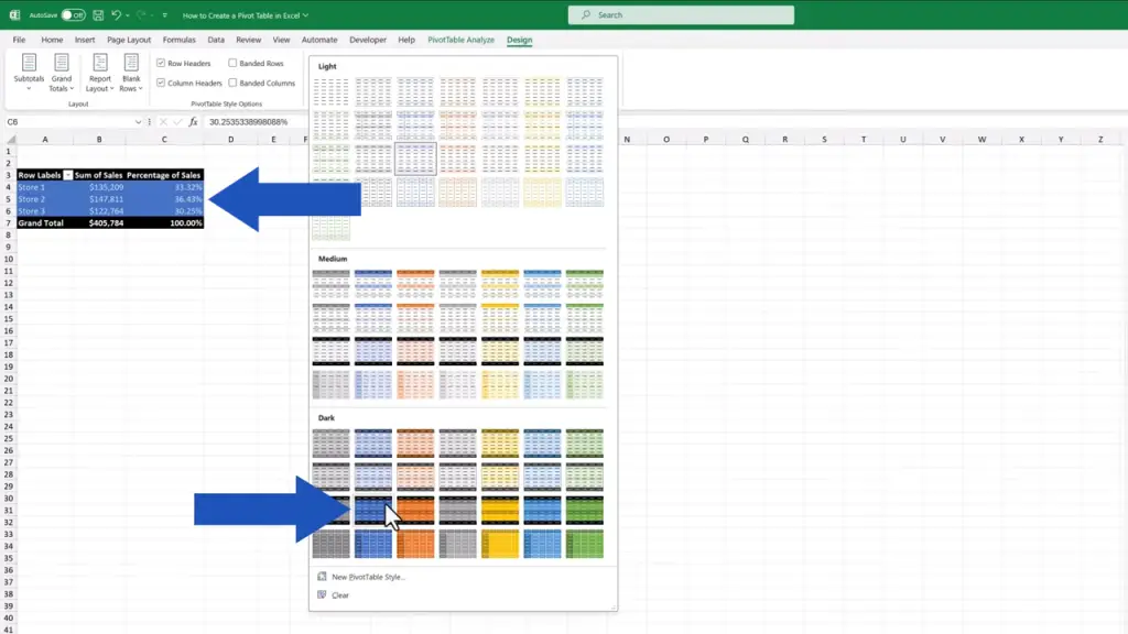
To change the table design, click anywhere within the table area again, go to the ‘Design’ tab and use this roll-down menu to choose the style you like best. Or make your own using the option down here.
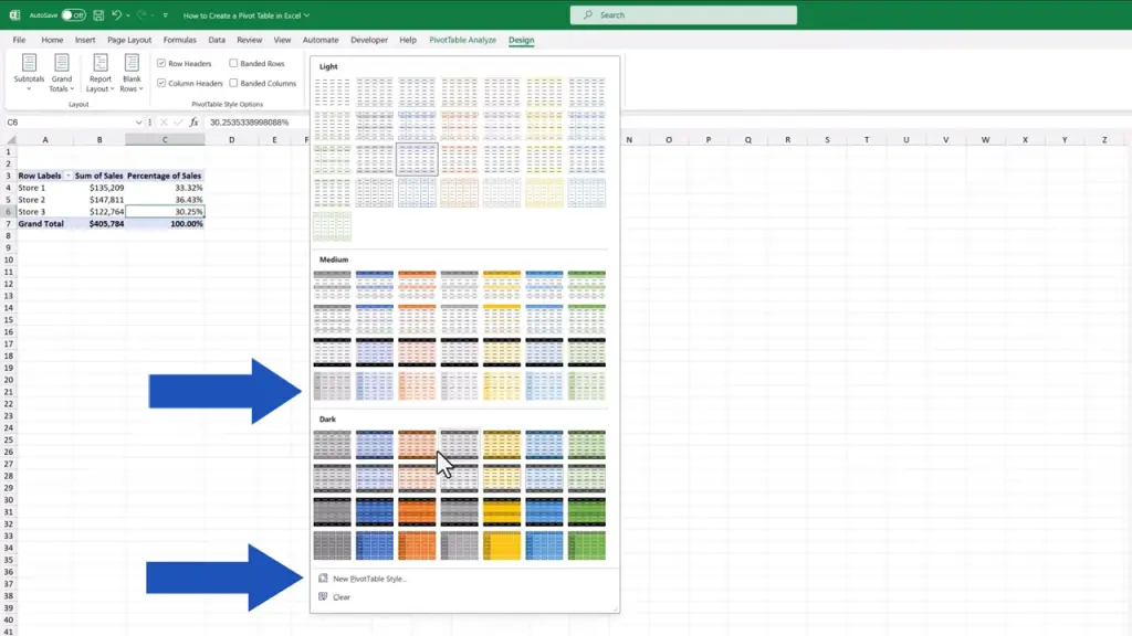
In this case, we’ll go for the dark blue one, so we click on it and here comes the table in all its beauty.
And to sort data in the table largest to smallest or vice versa is also child’s play. Let’s click on the column that contains the data we want to sort, then we right-click again and look for the option ‘Sort’.
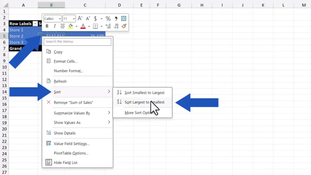
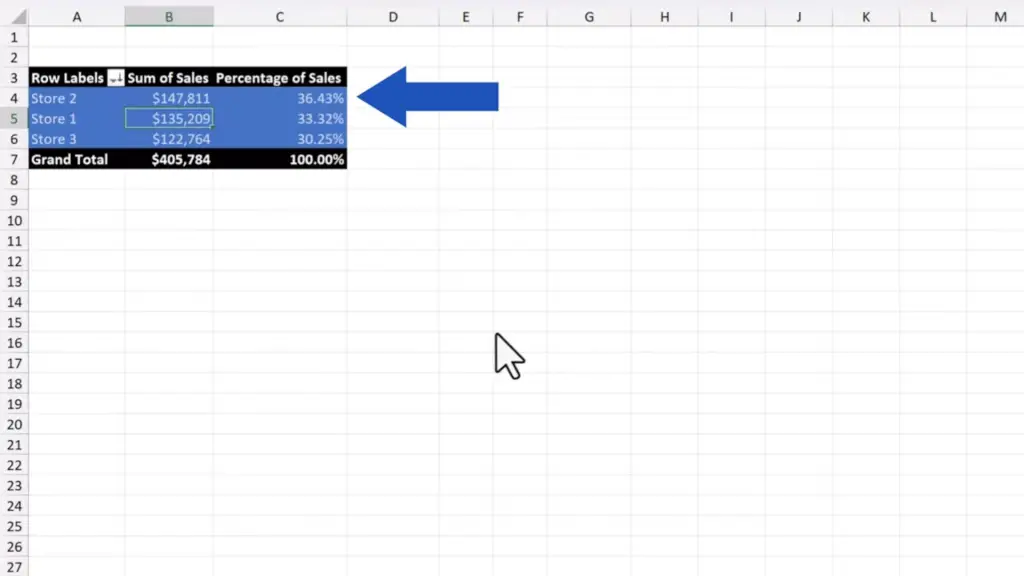
Now we can choose whether we want to sort the values smallest to largest or the opposite way. We go for ‘largest to smallest’ and we can immediately see the largest sum of sales made by Store 2, whereas the smallest sum of sales shows right next to Store 3.
How to Refresh a Pivot Table
And before we wrap it up, here comes yet another important detail.
When working with pivot tables, one must keep in mind that if something changes in the source data, it won’t be reflected automatically in the created pivot table. So, let’s go through how to update source data correctly together, which is actually easier done than it sounds.
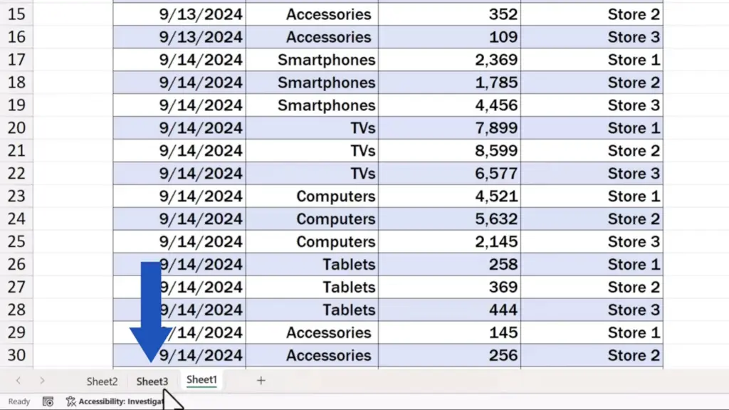
First, we need to go back to our source data table.

And change the sum of sales in Store 2 for the category ‘Smartphones’ to 56,321 USD.
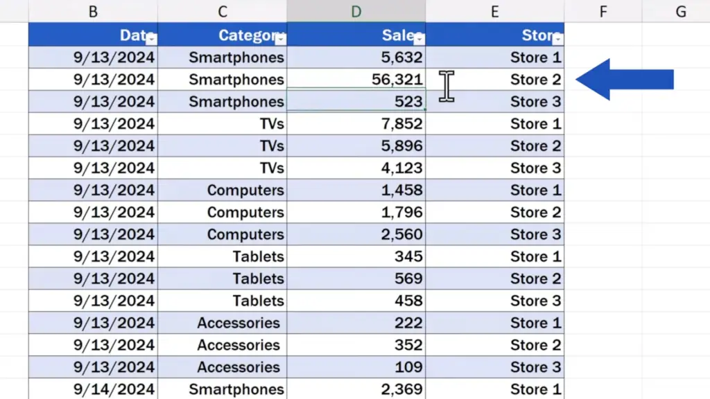
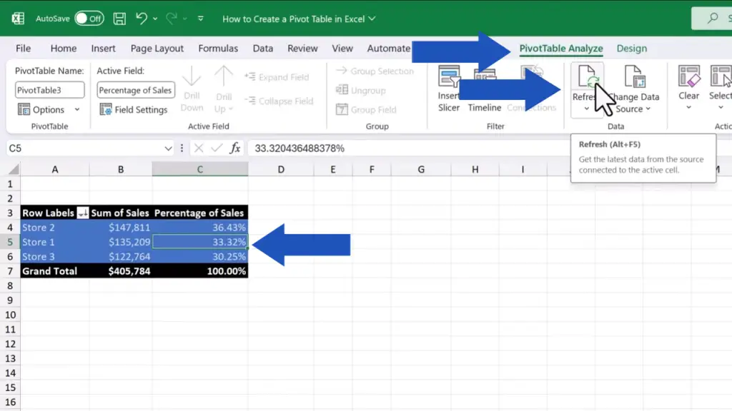
Now, when we click back to Sheet 3, where there’s our pivot table, nothing changed, obviously. That’s because the pivot table needs to be refreshed.
To do that, we click anywhere within the table area again to open the ‘PivotTable’ tab where we can find the button ‘Refresh’, which we need to press. Excel now revises the source data and updates the pivot table.
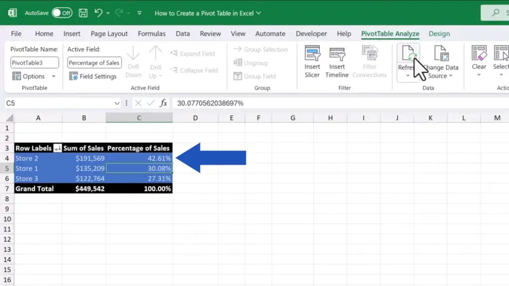
Well, that was it for today! We’ve seen plenty of helpful tricks on how to create and work with pivot tables – now just find the right opportunity to use the knowledge! Create your own pivot table and let us know how you did! Share your thoughts and ideas in the comments section below – we can’t wait to hear from you!
Don’t miss out a great opportunity to learn:
- How to Remove Blank Rows in Excel – BASIC
- How to Make a Table in Excel (Format as Table)
- How to Change Date Format in Excel (the Simplest Way)
If you found this tutorial helpful, give us a like and watch other tutorials by EasyClick Academy. Learn how to use Excel in a quick and easy way!
Is this your first time on EasyClick? We’ll be more than happy to welcome you in our online community. Hit that Subscribe button and join the EasyClickers!
Thanks for watching and I’ll see you in the next tutorial!

