How to Change Chart Colour in Excel
Today we’re gonna talk about how to change chart colour in Excel. This can be especially helpful if you need the colour of the bars in a chart to match your presentation theme, but also any time you need to use a colour different from the default one.
Ready to start?
Would you rather watch this tutorial? Click the play button below!
To change chart colour, first we double-click on any bar in the chart.
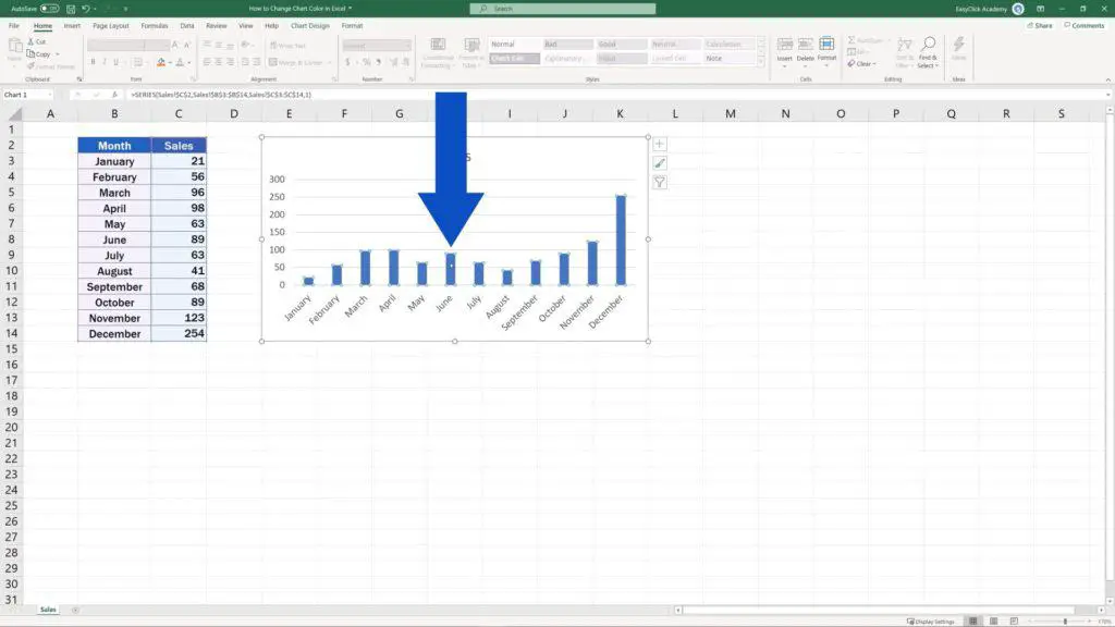
On our right, we can see a pane with various options to format data series.
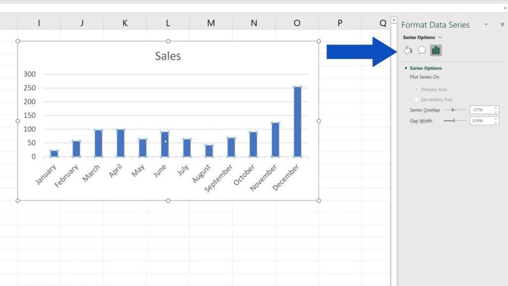
In this tutorial, we’re going to cover only how to change chart colour, so click on the option Fill & Line.
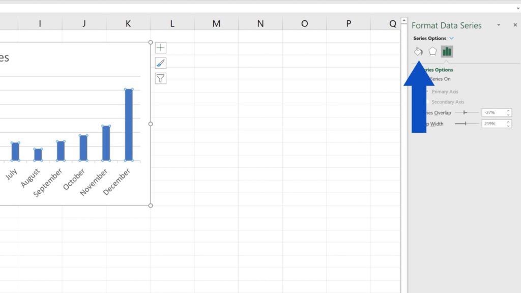
Here you can choose a colour fill for the bars as well as the border type.
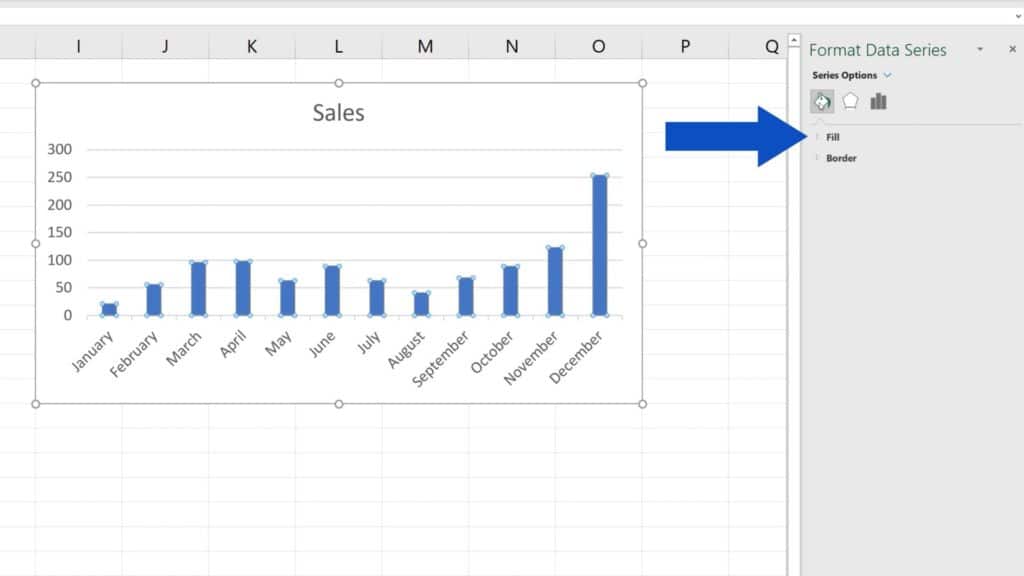
Let’s have a look at both options one by one.
How to Change a Colour Fill for the Bars
Expand ‘Fill’ and the menu that appears offers several options you can apply, like ‘No fill’, ‘Solid fill’ or ‘Gradient fill’ among many others.
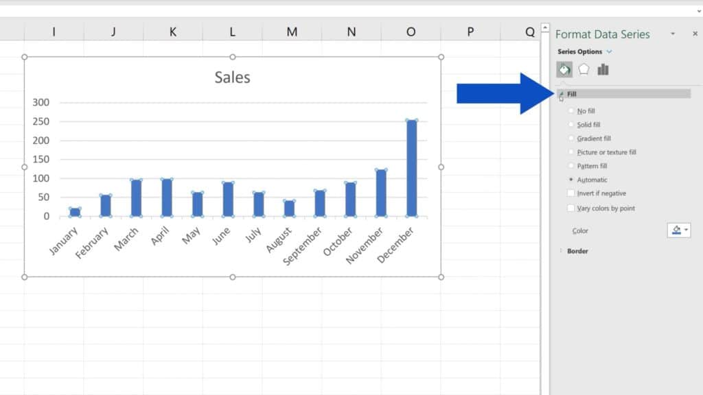
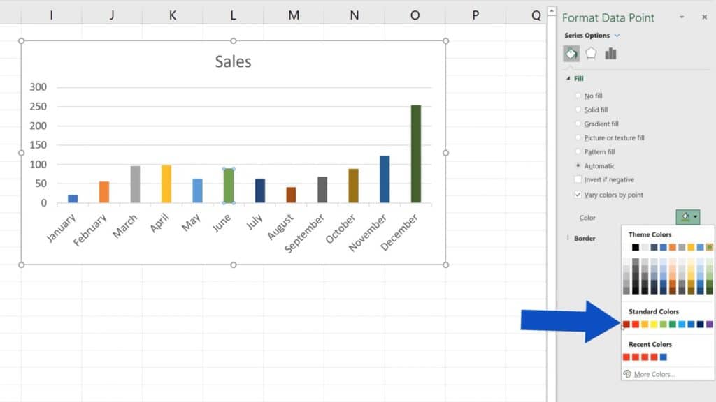
To change the default blue in all the chart bars, click on the icon next to ‘Colour’ and choose any of the pre-defined, standard colours offered here.
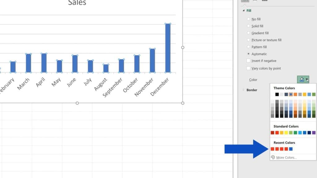
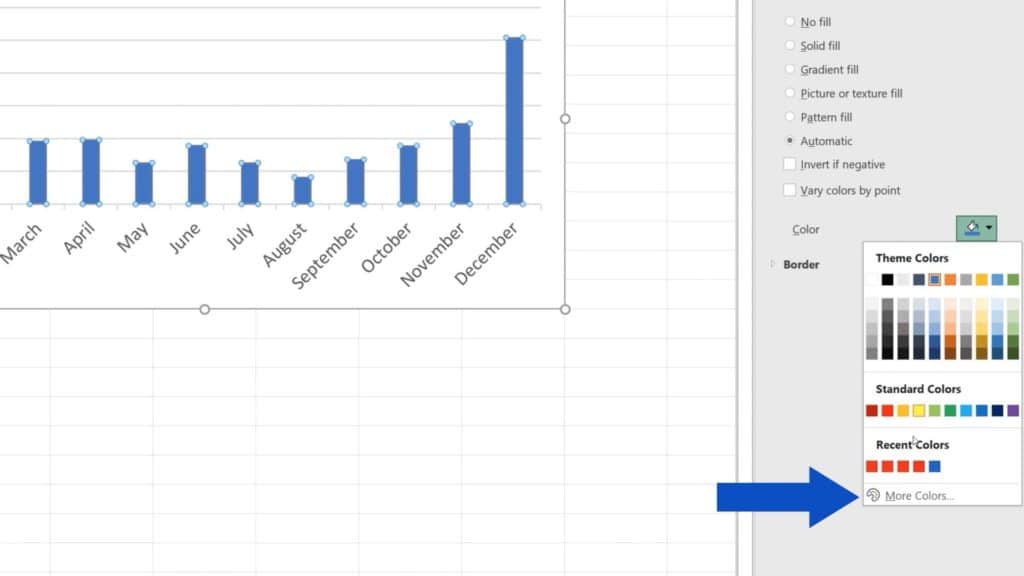
If this is not enough of a choice, you can use the option ‘More Colors’ at the bottom. Here you can mix any colour you need or you can define an exact colour using an RGB or a HEX code.
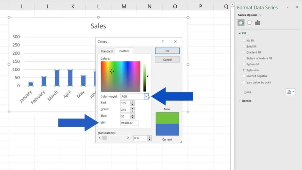
Let’s select this bright red and click on OK.
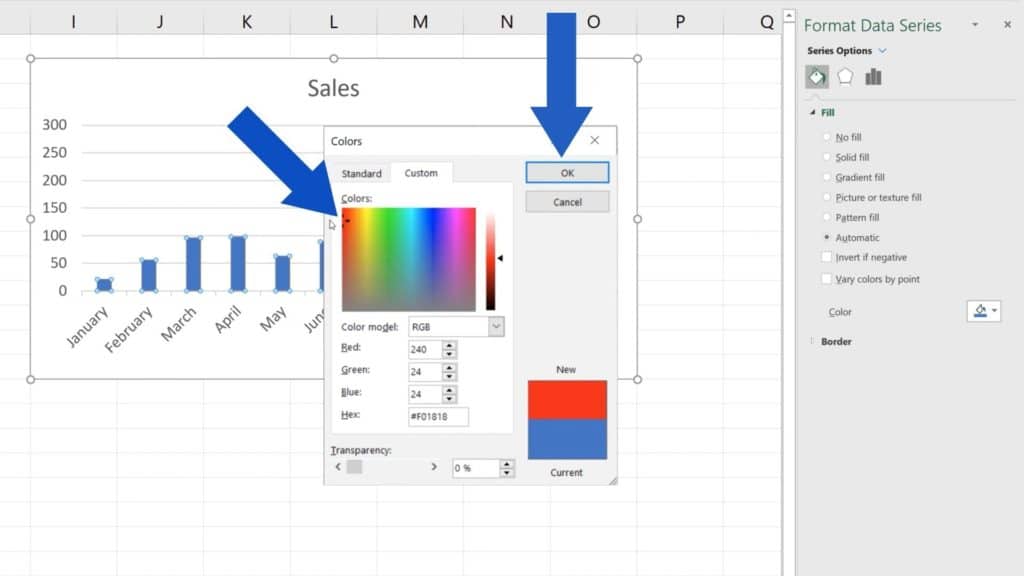
Excel will promptly change the bars colour to the one we’ve chosen.
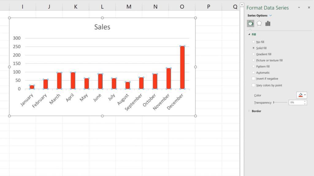
How to Use a Different Colour for Each Bar
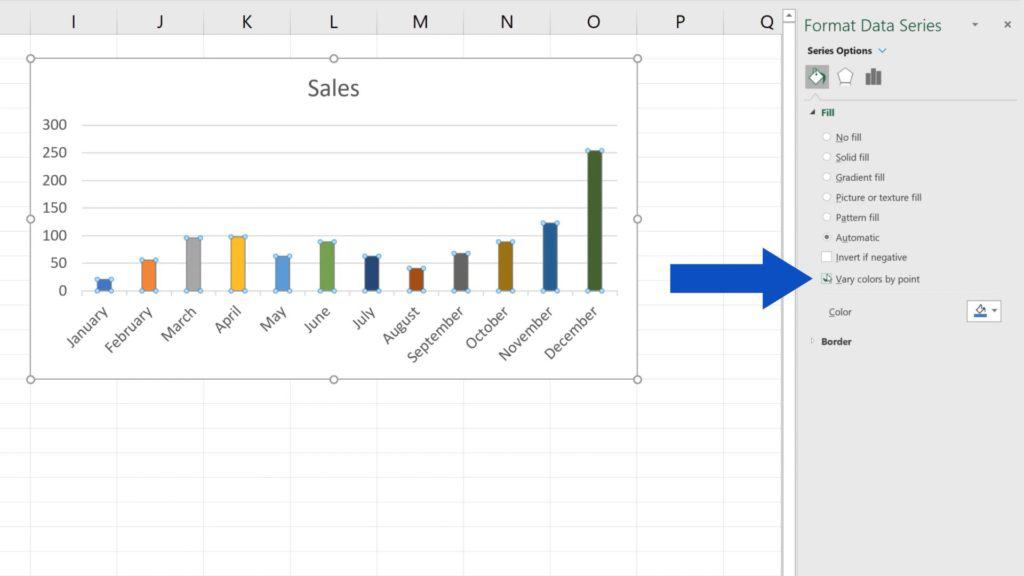
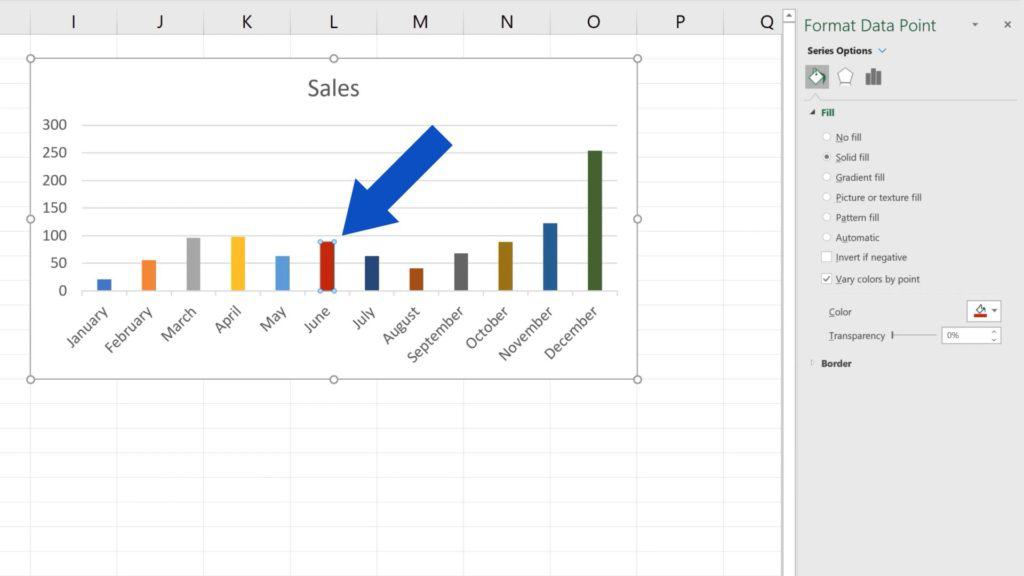
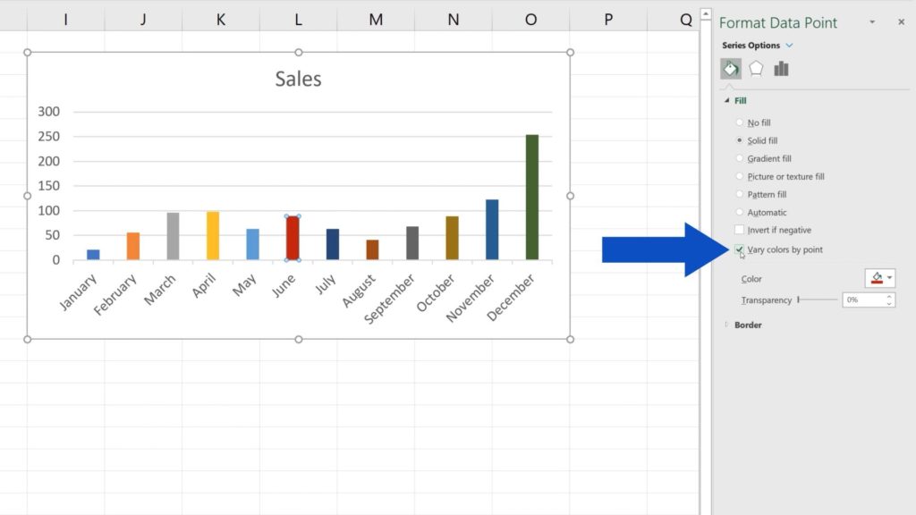
What’s amazing about this is that you’re not limited to use just one colour for all bars. To use a different colour for each bar, select the option ‘Vary colors by point’. Every bar in the chart now has its own colour fill and every single one can now be adjusted the way we saw a while ago.
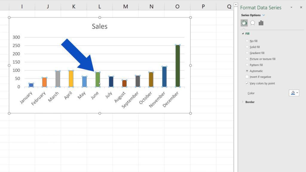
Let’s click on the June bar, for example, and change the green to this dark red.
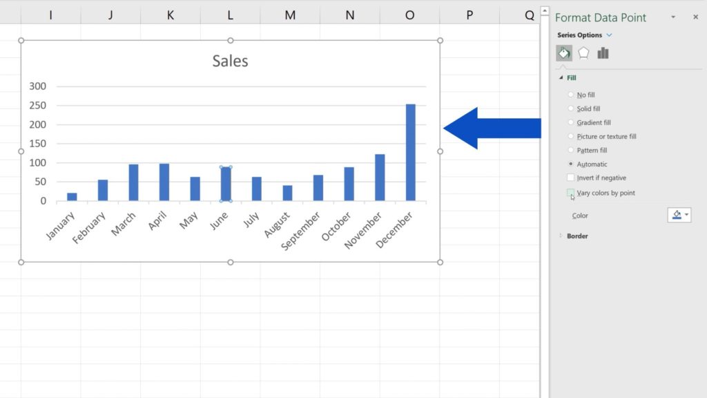
If you decide to return to only one colour for all the bars, simply unselect ‘Vary colors by point’ and that’s it! The chart’s back to one colour only!
And there’s one more thing worth knowing about.
How to Adjust Borders of the Chart Bars
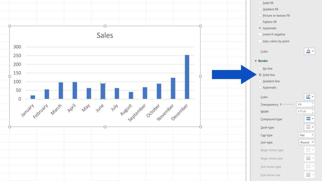
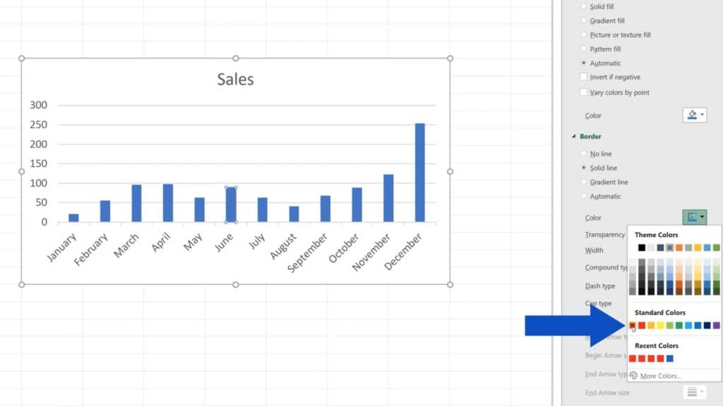
In terms of colours, you can easily adjust borders of the chart bars, too. Expand the ‘Border’ option and you’ll see another, very similar menu that applies to the borders of the bars.
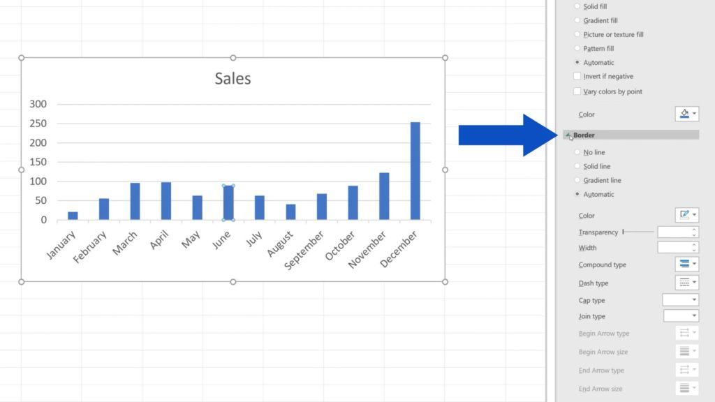
Let’s select ‘Solid line’ here and change the blue colour of the borders of the June bar to – let’s say – red.
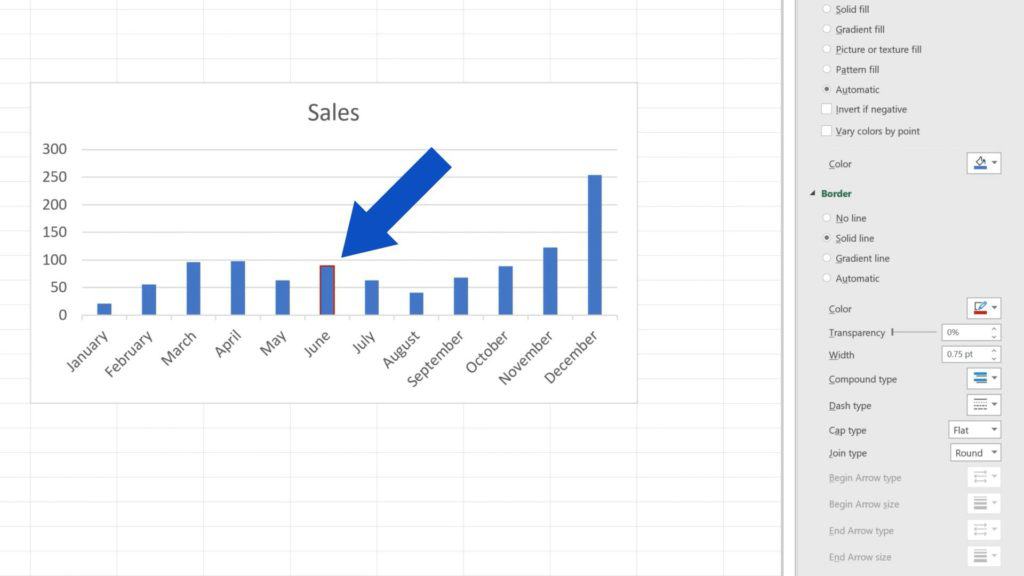
Here we go!
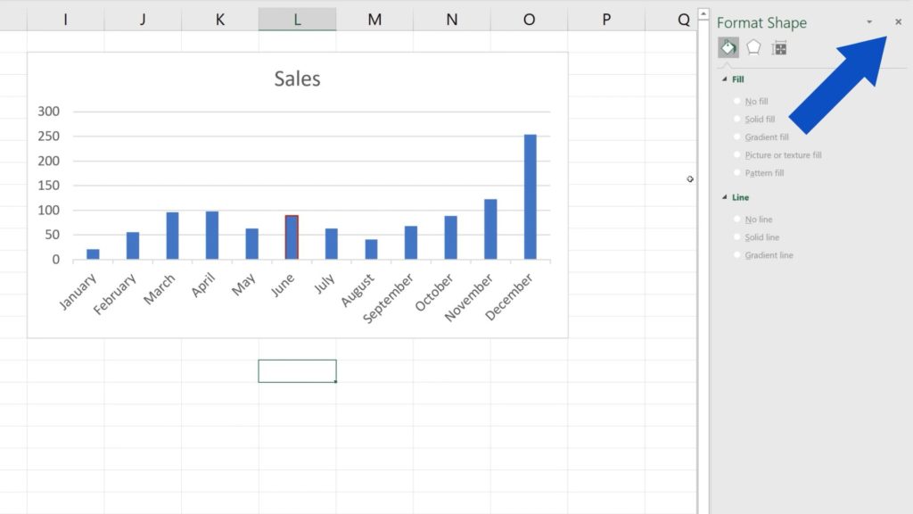
As soon as you’ve finished formatting the bar chart, simply close the pane by clicking on the X in the upper right corner.
There are a lot of great things you can do with your charts!
If you’re interested to see how you can format other elements in the chart, check out the links to more tutorials by EasyClick Academy! You’ll find them in the list below!
Don’t miss out a great opportunity to learn:
- How to Change Chart Style in Excel
- How to Add a Title to a Chart in Excel (In 3 Easy Clicks)
- How to Add Axis Titles in Excel
- How to Add a Trendline in Excel
If you found this tutorial helpful, give us a like and watch other video tutorials by EasyClick Academy. Learn how to use Excel in a quick and easy way!
Is this your first time on EasyClick? We’ll be more than happy to welcome you in our online community. Hit that Subscribe button and join the EasyClickers!
Thanks for watching and I’ll see you in the next tutorial!


