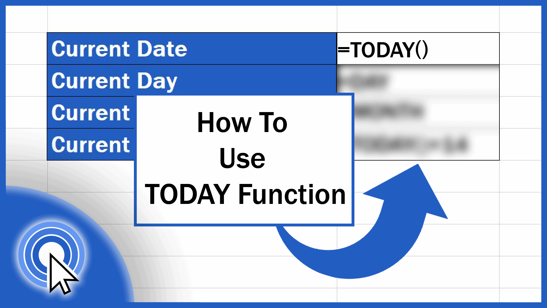
How to Use the TODAY Function in Excel (Useful Examples Included)
This tutorial shows how to use the TODAY function if you need to incorporate the information on the current date, day or month in an Excel spreadsheet.
Microsoft Excel quick and easy
New Excel tutorial every week

This tutorial shows how to use the TODAY function if you need to incorporate the information on the current date, day or month in an Excel spreadsheet.
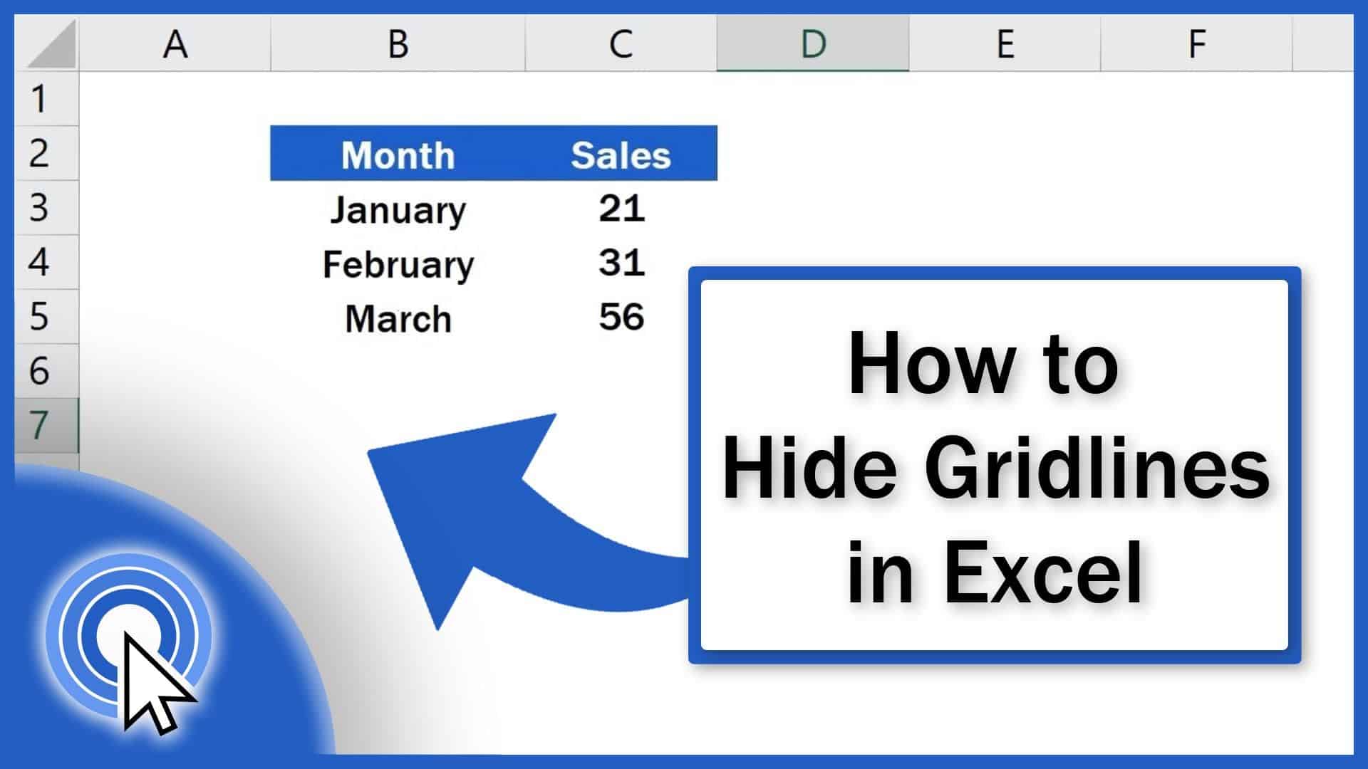
In this short tutorial you’ll see the easiest way how to hide gridlines in Excel, either in the whole spreadsheet or in a selected area.
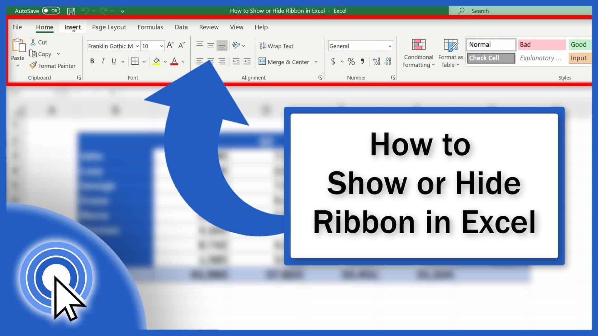
Today we’ll have a look at how to show or hide the ribbon in Excel. And you’ll see – it’s no rocket science. Let’s get started!
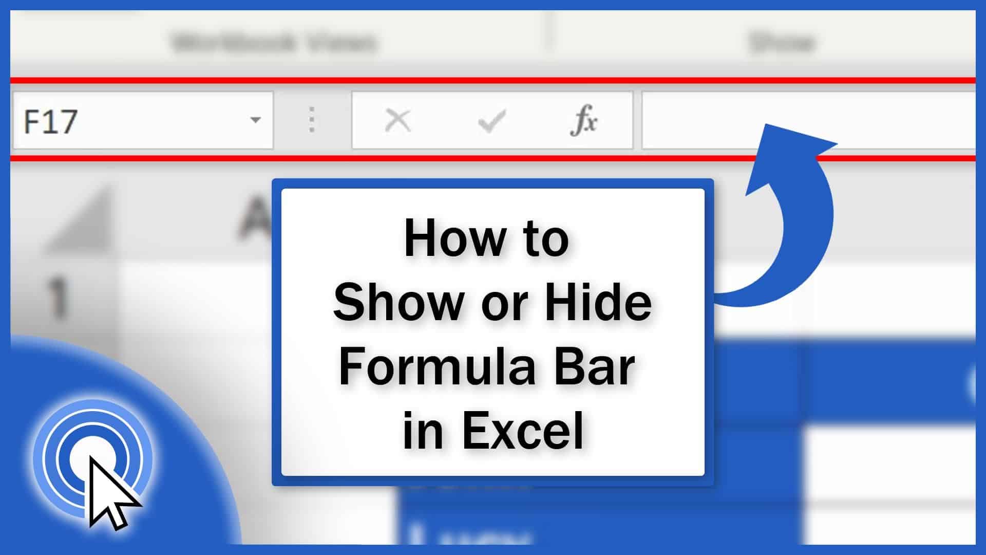
If you’re curious how to hide or show the formula bar in Excel you’re on the right place. Learn how to quickly show or hide the formula bar in Excel!
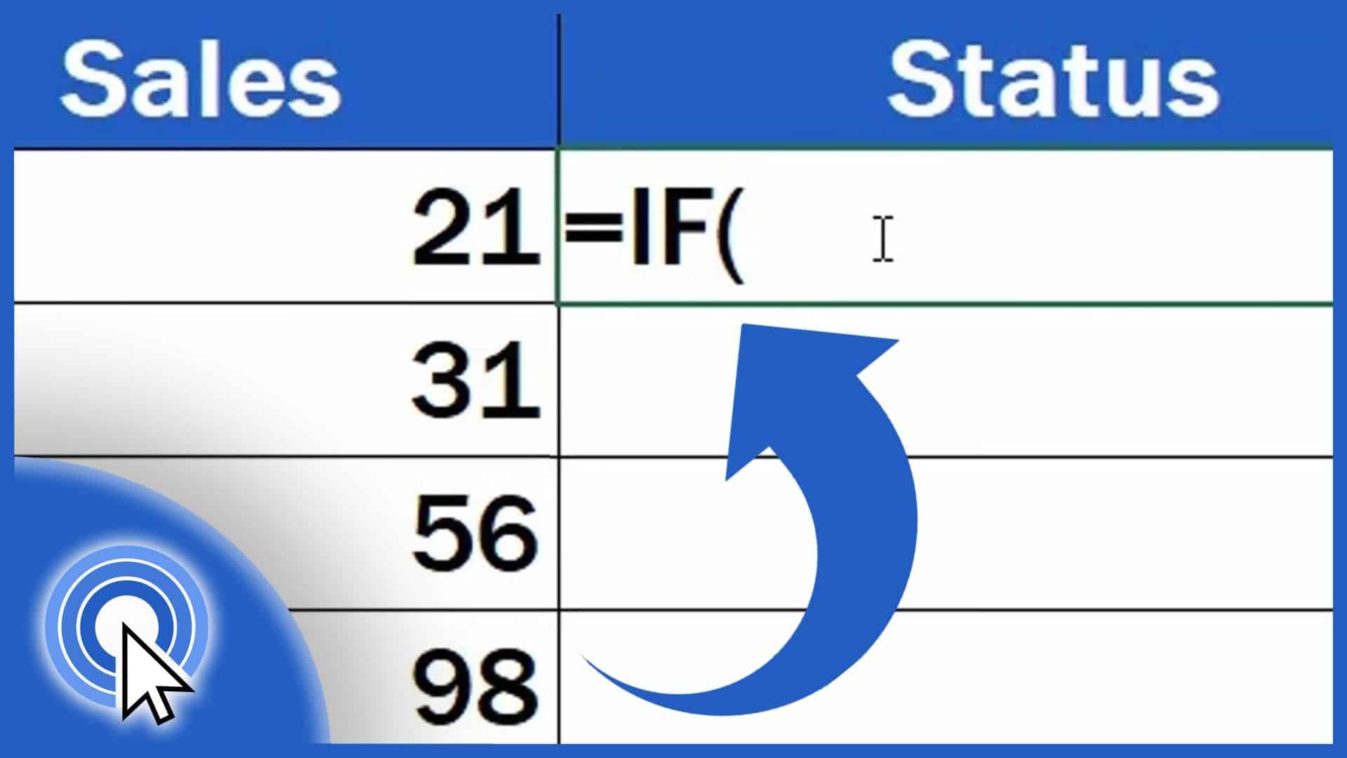
In this tutorial, you’ll see how the function IF helps evaluate whether the sales for a particular month met the goal that had been set.
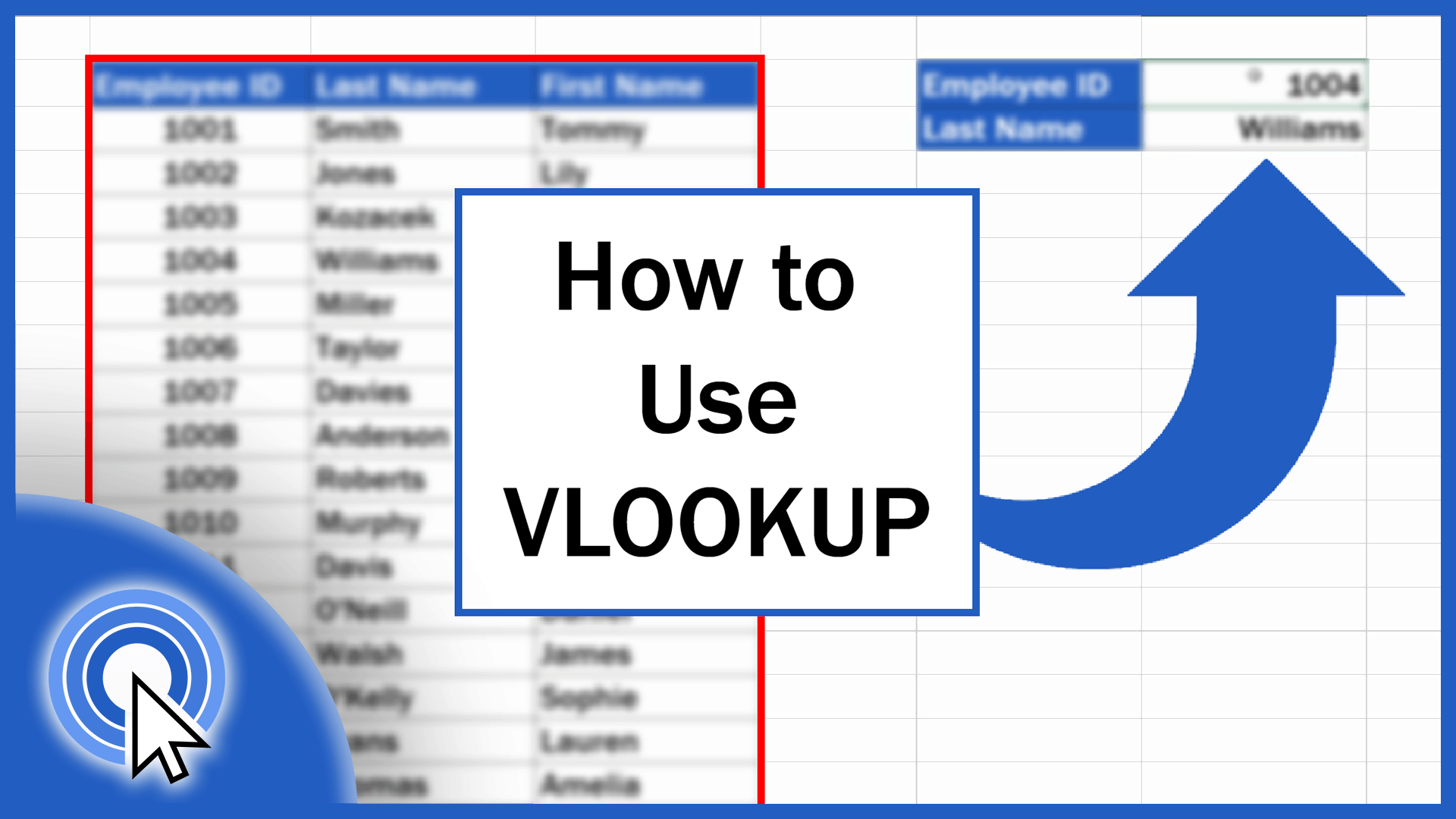
This tutorial offers a detailed description of how to use VLOOKUP in Excel. The VLOOKUP function in Excel performs a case-insensitive lookup.
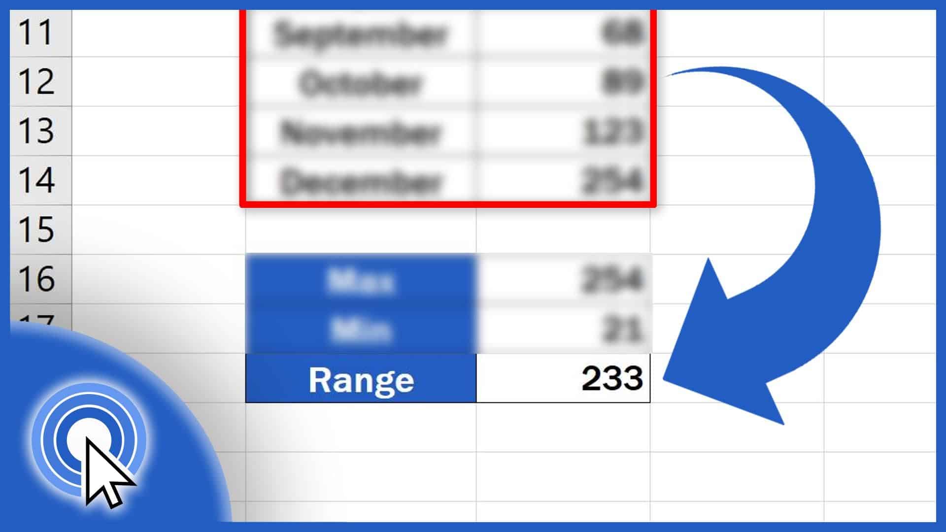
Learn three easy steps to calculate the range of a set of data in Excel, no matter how many values there are in the data table you’re working with.
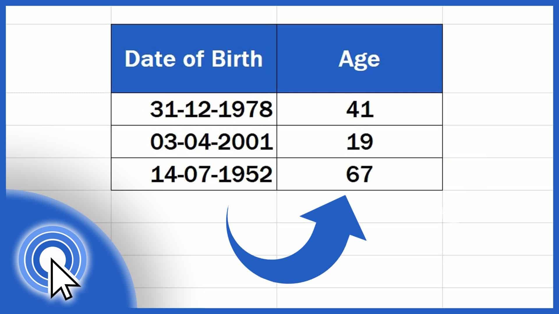
Learn how to calculate age using a date of birth in Excel. You’ll be able to find out the exact number of years that passed from a date of birth until now.
Sometimes the function Search in Excel comes handy. Let’s have a look together at how to search in an Excel sheet in a simple and easy way.
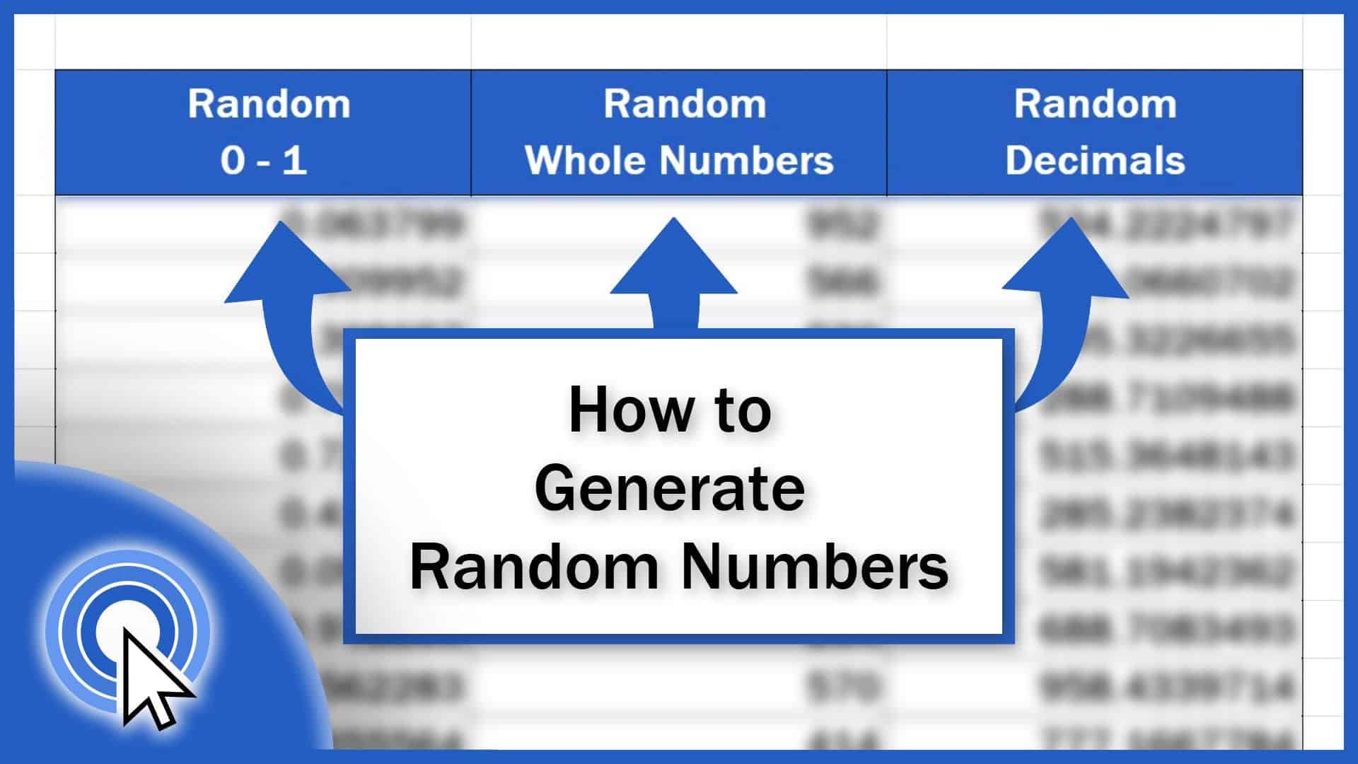
This tutorial covers how to generate random numbers within any range you define, whether you need to generate whole numbers or decimals.